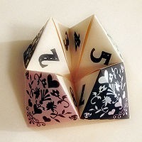
Click on the letters on this page to see an animation showing how to fold the origami letters below. There are 2 separate alphabets (you probably have to scroll down to see the second set.) {Found in a comment on this post.}
 The workshop I attended last weekend, as part of the Handmade/Homemade exhibit, had 2 parts. First we learned how to do Suminagashi, a form of water and ink paper marbling, from Suzanne Vilmain. This was followed by JenMarie Davis’ Context/Content Divination: Methods of Generation.
![]() JenMarie’s method is broader than the biblio-divination I wrote about earlier this week. She and her partner at Fact-Simile Press publish others poems, and she uses her techniques to create artist’s books to couch these texts. Her method could certainly be used to generate the texts as well, but like JenMarie, I usually start with someone else’s text for my books, and my challenge is always how to design a structure that enhances that text.
JenMarie’s method is broader than the biblio-divination I wrote about earlier this week. She and her partner at Fact-Simile Press publish others poems, and she uses her techniques to create artist’s books to couch these texts. Her method could certainly be used to generate the texts as well, but like JenMarie, I usually start with someone else’s text for my books, and my challenge is always how to design a structure that enhances that text.
![]() For me the word “divination” means a way to predict the future, like reading a tarot card, which isn’t much help in designing a book. But JenMarie wanted us to take away a method of asking questions about our texts or idea for content, and then a way to constrain the answers so we could make headway with a design. Her “divination” device is a paper fortune teller. (You may call it a cootie catcher. Wikipedia has directions for making and using one.)
For me the word “divination” means a way to predict the future, like reading a tarot card, which isn’t much help in designing a book. But JenMarie wanted us to take away a method of asking questions about our texts or idea for content, and then a way to constrain the answers so we could make headway with a design. Her “divination” device is a paper fortune teller. (You may call it a cootie catcher. Wikipedia has directions for making and using one.)
![]() Instead of using colors and numbers to guide the answer to a question, as in the Wikipedia directions, JenMarie had us use our biggest concerns when making a book (two of mine are: “what structure best suits the text” and “how can I make whatever I come up with affordable”) as well as a list of things to consider about a text — the story or narrative, images, sounds, memories that arise… We all folded up fortune tellers and tried them on a simple example text and image. I often get stuck when thinking about my book designs — they come slowly — and I left the workshop intrigued by the idea of asking questions that could refocus my attention.
Instead of using colors and numbers to guide the answer to a question, as in the Wikipedia directions, JenMarie had us use our biggest concerns when making a book (two of mine are: “what structure best suits the text” and “how can I make whatever I come up with affordable”) as well as a list of things to consider about a text — the story or narrative, images, sounds, memories that arise… We all folded up fortune tellers and tried them on a simple example text and image. I often get stuck when thinking about my book designs — they come slowly — and I left the workshop intrigued by the idea of asking questions that could refocus my attention.
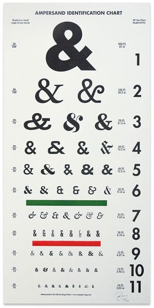
 Doug Wilson makes letterpress posters from his collection of wood type. This one is an “Ampersand ID Chart” based on the familiar Snellen eye chart. And here’s another one:
{First seen here}
This past weekend, I participated in a workshop associated with a small book arts exhibit here in Santa Fe, Handmade/Homemade. The mini exhibit features letterpress chapbooks, one-of-a-kind editions and broadsides from small literary presses. As part of the workshop, I got to look at some of the books, most of them of poetry, and cleverly done. One I particularly liked was Helen White’s book Ariadne, pictured below. She’s a visual poet, and each page used some part of the body for the poem, while the transparency kept the coherency of the figure. More pictures of books from the exhibit are here and here.
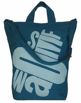
 I’ve written before about Jack Stauffacher and his wood type prints. He’s made a wood type design with the letters SFMOMA and the museum has it on T-shirts, canvas tote bags, reusable grocery bags, mugs, ceramic double-walled coffee cups, and acrylic tumblers. You can see them all here.
 As I get my new studio set up, I’ve been looking forward to, and very curious about, what sorts of projects I’ll do this year. When I moved from the garage to a separate, much larger, space in 2006, I began making letterpress prints, a departure from my books.
![]() I don’t have any particularly well-formed ideas, but I know I’d like to design and publish another “poem-book” this year, and have several poems earmarked as possible candidates. I’ve been so preoccupied with moving and getting to know my new home that I’ve had trouble concentrating on how I might incorporate any of the poems into an artist’s book. I’ve been grateful to have found the Santa Fe Book Arts Group. Their journal project has allowed me to do small, contained projects that work out some of my ideas. They’ve also dedicated several monthly meetings to techniques and ideas for journal pages. Several members showed various methods for getting marks on the pages (stamping, sewing, transfers, etc.). But the one that really caught my attention was Geri Michelli’s session on what she called “biblio-divination.”
I don’t have any particularly well-formed ideas, but I know I’d like to design and publish another “poem-book” this year, and have several poems earmarked as possible candidates. I’ve been so preoccupied with moving and getting to know my new home that I’ve had trouble concentrating on how I might incorporate any of the poems into an artist’s book. I’ve been grateful to have found the Santa Fe Book Arts Group. Their journal project has allowed me to do small, contained projects that work out some of my ideas. They’ve also dedicated several monthly meetings to techniques and ideas for journal pages. Several members showed various methods for getting marks on the pages (stamping, sewing, transfers, etc.). But the one that really caught my attention was Geri Michelli’s session on what she called “biblio-divination.”
![]() Geri started by showing us a copy of Tom Phillips’ Humument, created over William Hurrell Mallock’s 1892 novel A Human Document. (Phillips drew, painted, and collaged on the pages, while leaving some of the original text showing through.) She then passed out pages from an old Reader’s Digest and told us to circle or lightly mark half a dozen words or phrases, then use a marker or crayon to blacken out the rest of the words. She showed us some of the small 3-4 page books she’d made this way, and the resulting texts were quite poetic. My first attempt was gibberish, but sort of haiku-like. So I tried again with better results.
Geri started by showing us a copy of Tom Phillips’ Humument, created over William Hurrell Mallock’s 1892 novel A Human Document. (Phillips drew, painted, and collaged on the pages, while leaving some of the original text showing through.) She then passed out pages from an old Reader’s Digest and told us to circle or lightly mark half a dozen words or phrases, then use a marker or crayon to blacken out the rest of the words. She showed us some of the small 3-4 page books she’d made this way, and the resulting texts were quite poetic. My first attempt was gibberish, but sort of haiku-like. So I tried again with better results.
![]() It occurred to me immediately that this technique might help with my haiku writing. I try to write a haiku a day, but for the past year have had a very hard time getting focused enough to get something, even something unsatisfying, onto paper. So I’ve been using the newspaper as a crutch (rather than Reader’s Digest!) — at first I selected 3 short phrases from one of the pages and used them as the basis for my daily haiku. More recently, when I get stuck, I select one phrase or even one or two words to get me started. The business section hasn’t proved as fruitful as, for instance, the Friday movie reviews. It’s really gotten me to write haiku about subjects that I wouldn’t have thought to consider! I suppose this post wouldn’t be complete without sharing one of my attempts using phrases I picked:
It occurred to me immediately that this technique might help with my haiku writing. I try to write a haiku a day, but for the past year have had a very hard time getting focused enough to get something, even something unsatisfying, onto paper. So I’ve been using the newspaper as a crutch (rather than Reader’s Digest!) — at first I selected 3 short phrases from one of the pages and used them as the basis for my daily haiku. More recently, when I get stuck, I select one phrase or even one or two words to get me started. The business section hasn’t proved as fruitful as, for instance, the Friday movie reviews. It’s really gotten me to write haiku about subjects that I wouldn’t have thought to consider! I suppose this post wouldn’t be complete without sharing one of my attempts using phrases I picked:
The second stop was Milan,
Two men standing on a balcony —
Male models.
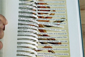
(The picture above is from an interesting website, onlab, and a book they feature called Urban Jealousy.)