Banned books

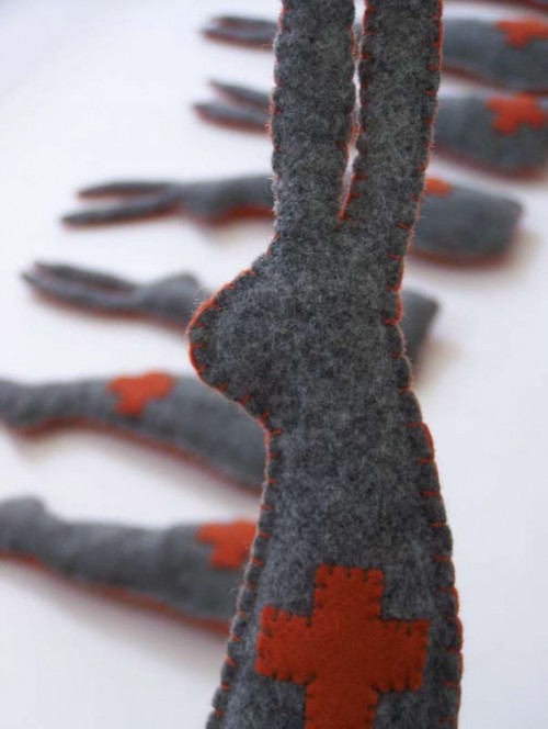
When I told my sister about my artist in a matchbox series, she reeled off a list of artists I should consider. One name was Joseph Beuys. She didn’t know much about him other than he’s a favorite with one of her friends. What I knew was this bunny by Shannah Burton, which I saw soon after I started selling on Etsy and that I’d bookmarked intending to find out more “someday.”

Beuys Bunny

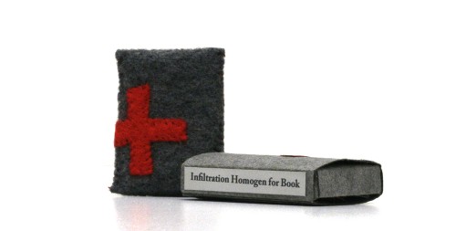
Turns out that Beuys has a famous performance piece, How To Explain Pictures To A Dead Hare, where, holding a dead hare in his arms, he walked around, whispering to the hare, explaining the art on the walls. He also used felt in his installations and performances, like this one, called Homogeneous Infiltration for Piano

Infiltration homogen für Konzertflügel (Homogeneous Infiltration for Piano), Joseph Beuys

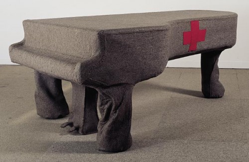
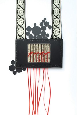
Beuys, a German who served in the German army during World War II, said the red cross is a symbol for the danger that people face when they remain silent. The work strikes me as sad, with the sound (and potential) of the instrument trapped inside the felt skin. As a viewer, I want to tear off the felt and unmute the piano.

For my artist in a matchbox series, I’m looking for artists whose art lends itself to books. So in the spirit of Beuys, I designed a matchbox containing a banned book, one that has been silenced not only by felt but humans. Here it is, and you can see more pictures here.

Beuys Book, Green Chair Press

Book Collages

I always enjoy looking at Lisa Kokin‘s book art. This is one of her “book collages,” Love Always Juanita. She has a nice explanation of her process

In my never-ending quest to find different ways to eviscerate books, I stumbled upon the book collage. First I find a book which interests me, either for some element of text, image or marginalia, or for the look of the book itself. Sometimes I remove some of the pages and glue and/or sew the book open to the particular page of interest. Other times I remove all the pages and use the inside covers as the collage surface. I build upon what initially interests me by layering images and text from the same or other books, found photos, and other small objects, using a variety of collage and transfer techniques. Often I scrape away and dig into the surface as well. Many of the books have sculptural protrusions and extensions because I feel that the shape of books should not be limited to a rectangle.

I am particularly attracted to the lowest of literary life forms, the Discarded Library Book. My favorites have “DISCARD” stamped on the inside front covers, and as if this isn’t insult enough, “DISCARD” stamped here and there on the inside as well. The largest number of book collages come from a series of citizenship workbooks tossed away by my local public library and rescued from extinction by an acquaintance who works there. These little volumes make all sorts of statements and promises about our country which are belied by history and current events. “Why do we elect honest men to office?” A statement like this is all I need to get my itchy fingers cutting, pasting, altering and subverting.

Lisa Kokin, Love Always, Juanita

Serenity

Mid-winter is always a very quiet time for me—lots of planning for the year and slowly refilling my shelves with all the things I sold over the holidays. I think that’s why I’m drawn to images of quiet books this time of year. The one below is by Meredith Beckett (I can’t find a website for her), made as part of a book swap. I found it on this blog post. I especially like the shapes and interplay of colors as well as its simplicity.

notuboc.jpg

Tour de Lead Graffiti 2013

Tour de Lead Graffiti 2013Imagine letterpress printing getting a mention in Sports Illustrated! Here’s what writer Alexander Wolff wrote: “Each morning during the [2013] Tour de France, members of the [Newark, Del.] Lead Graffiti printmaking collective gathered to watch that day’s stage. They took note of every salient breakaway, pratfall and Phil Ligett bon mot, then spent the rest of the day producing a broadside that captured the action. The results are like the peloton, a riot of shapes and colors. The designers call what they do ‘endurance letterpress,’ for they repeat the routine 23 days in a row and, like the Tour itself, scrupulously post total elapsed time.”
Quite a feat—23 posters in 23 days! See all the posters here. And they’ve done this for 2011 and 2012 as well!