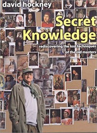
 Recently I read a review of the movie “Tim’s Vermeer,” which details inventor Tim Jenison’s efforts to duplicate the painting techniques of Johannes Vermeer using optics and lenses. The review mentions David Hockney’s book Secret Knowledge which covers the same subject. Since the movie hasn’t shown up here in Santa Fe, I got Hockney’s book from the library instead.
 Hockney’s premise is that European artists used lens and optical tricks to produce paintings that are almost photo-realistic, long before the invention of the camera. To investigate this idea, he covered the walls of his studio with a time line of reproductions of Old Masters and started studying them. The book takes the reader along his journey to find clues to back up his theory. The first half is primarily visual, full of good color reproductions, as he walks the reader through his observations on painting between 1400 and 1500 and how there was a giant leap toward realistic portraiture. Whether or not you believe Hockney’s thesis that it wasn’t just artistic genius but optics that helped produce the art, he makes you look at the paintings in a new way. He says at the beginning that easily attainable full color reproductions and Photoshop have made verifying his thesis possible. And that the book is the perfect medium to present his argument (rather than a video or museum exhibit or even a lecture):
You bring your own time to a book, it is not imposed, as with film or TV. With a book you can stop to think something through, or go back and look at something again if you need to.
The rest of the book is written material to back up his theory, most of it in a very hard-to-read font, which wasn’t at all pleasurable to read. But the front half is a lovely treat for the eyes!