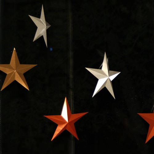
The printed, punched and trimmed pages for “persimmons.” Next step is sewing the braille letters in the punched holes.
![]()
The printed, punched and trimmed pages for “persimmons.” Next step is sewing the braille letters in the punched holes.
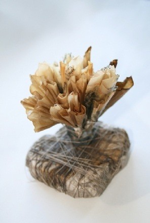
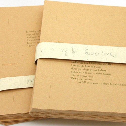
I’m doing a new book with a poem called Persimmons by Li-Young Lee. Good thing I’ve been designing it while persimmons are in season, as I’ve been carrying one around, using it to match oranges and greens for the paper and thread. I thought I’d found the perfect orange for the cover and box, but the manufacturer isn’t making it anymore. And finding the perfect green turned out to be the most vexing problem. I like the design process a lot, it’s so full of surprises, especially what ends up being sticking points (usually what I think will be an easier part of the process!) Pictured is my final model, using a woven binding developed by Elizabeth Steiner. The poem inside will be letterpress printed.
Recently I stumbled on a website called Pattern Prints Journal and from there I found Karen Kunc’s work. She makes bookworks that use woodcuts, patterns, watercolors and poetry. Here are several that I liked. You can see the original article I found here and Karen’s website here.
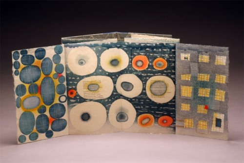
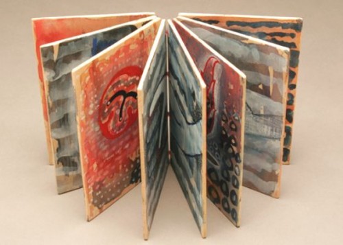
Ephemera, 2009, artist book: woodcut, letterpress, polymer relief, leather. Poems by Robert Pinsky., 10″ x 6″ folded, 10″ x 42″ unfolded
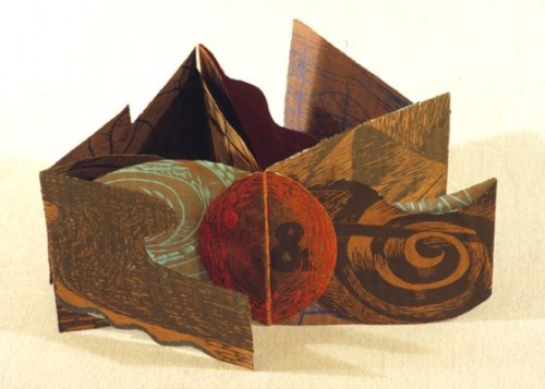
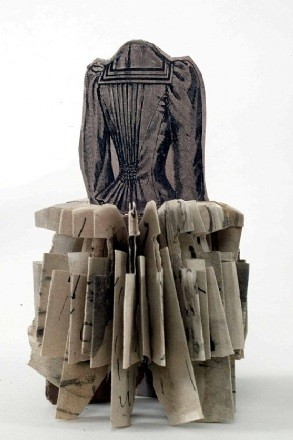
O &, 1991, bookwork: woodcut, intaglio and letterpress on shaped paper, 6.5 x 6.5″

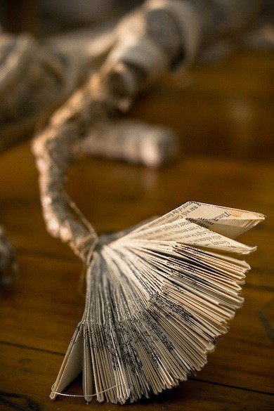
Vastness, 2011. unique bookwork: watercolor on basswood, sewn binding, poem by Walt Whitman, 6″ x 4″ folded, 6″ x 32″ unfolded
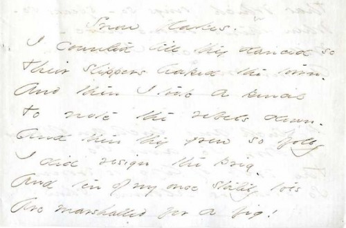
The other day I wrote that I couldn’t find an Emily Dickinson’s handwriting font. Turns out there is—a reader sent me a link to this free font. I tried it on a Dickinson poem I’m including in a book I’m designing. Here’s the poem
Snow flakes.
I counted till they danced so
Their slippers leaped the town –
And then I took a pencil
To note the rebels down –
And then they grew so jolly
I did resign the prig –
And ten of my once stately toes
Are marshalled for a jig!
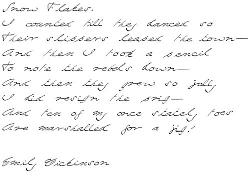
Here it is in Dickinson’s hand (from the Emily Dickinson Archive)
Here it is in the free font
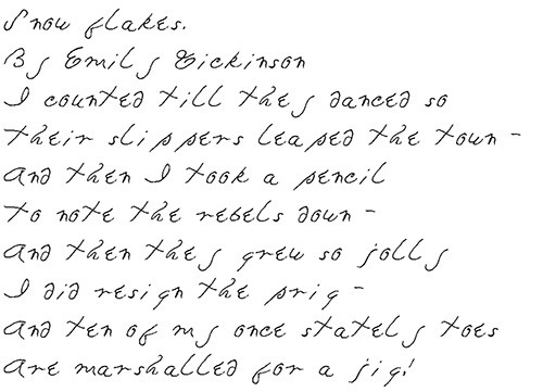
I realized that I wanted something that was like Dickinson’s handwriting but legible. The free font was a start, but wasn’t as readable as I wanted. It also looks more like printing, rather than cursive. And while Dickinson did print many of her later poems, Snow Flakes is a very early poem when she was using script. So after looking at a lot of Dickinson’s handwriting on the archive, I waded in to make my own font, but with only the letters I would need. The free font package let me make the letterforms, but I had to do an awful lot of fiddling with kerning and baselines in indesign in order to make them work visually. Here’s my latest take: