I’ve collected a lot of little paper scraps over the years, all thrown in a shoe box. I’m finally getting around to organizing them, by color in glassine envelopes I have lying around. I was also in the mood to make a book, and thought it would be fun to construct one with an accordion-fold spine with tipped-on envelopes (I wanted an accordion, rather than a fixed, spine so the book can grow as I add stuff to the envelopes.) There are directions for making this sort of book here. These directions use card stock for the spine, but that probably won’t hold up very well, so I used Tyvek instead.
 Tyvek is a water resistant and nearly indestructible material/paper. White Federal Express envelopes are made with Tyvek. New home construction is often wrapped with it. It’s light-weight, doesn’t tear, but is easy to cut with scissors or an xacto knife. And, best of all, it doesn’t have a grain and folds really crisply in either direction. It’s great for spines in bookbinding. I get mine at Kelly Paper, but if you just want to experiment, you can buy a envelope made of Tyvek at an office supply store and cut it up.
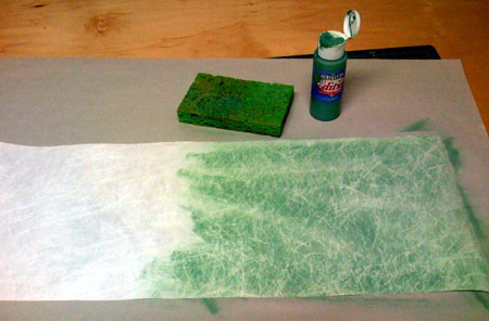
 The biggest drawback is that it’s a glaringly white color. Printing on it is difficult, but it can be painted with a sponge and water-based acrylic paint. Dampen the sponge, put a bit of paint on the Tyvek and use the sponge to rub out the paint into a very very thin layer. It’ll dry almost instantly. The paper gets a sort of marbled effect.
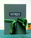
Here’s some pictures of my envelope book. Click on them to see a bigger image. Unfortuantely this book won’t hold very much of my paper scrap collection. But it’s perfect for having some scraps to play with at home, away from my studio.



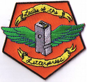 At the San Francisco Center for the Book’s holiday fair last month, my PodPost friend Carolee was selling these Ladies of the Letterpress patches for her friend Jessica White of Heroes & Criminals Press. I immediately snatched one up for my printer’s apron, to go along with my other merit badges.
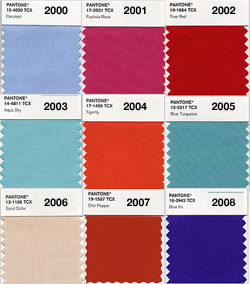 In a
In a 


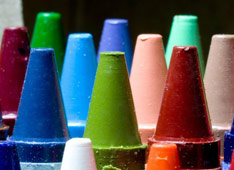 As a kid, courtesy of my large box of Crayola crayons, colors were synonymous with words: apricot, almond, goldenrod… (of course