Spring Fever

spring feverThe weather has turned warm here in Northern California (that’s the magnolia tree in my front yard) and I’ve been outside as much as possible. But no one ever seems to want to enjoy the season at hand — my mailbox is full of enticing summer bookmaking programs, making me want to skip right to July.
The Wells Book Arts Center in upstate New York has three week-long sessions, with intriguing titles like “Moving Parts: The Book as Kinetic Sculpture” taught by Dolph Smith and “Considering Text and Image” taught by Inge Bruggeman. A brochure is available here.
A new intensive debuts this year in England, at Wellington College in Berkshire, organized by two teachers well known here in the Bay Area — Dominic Riley and Michael Burke. You can find out all about it on their website.
Anyone know of any more?

Small Press Month

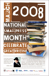
2008 Small Press MonthMarch is Small Press Month in the US — an annual celebration of the small independent publisher. I’m celebrating by buying my friend Carol Peter’s first poetry chapbook, Muddy Prints, Water Shine from Finishing Line Press (Carol’s poetry was published as part of the New Women’s Voices Series chapbook competition.)
I also bought a letterpress printed zine from artnoose to add to my small but growing collection of letterpress printed pamplets and chapbooks. There are lots more zines for sale on Etsy, check them out!
For free, in San Francisco tonight, City Lights hosts a group reading by authors and poets from six local independent presses. And the Small Press website has a list of other events around the country.

Helvetica: the most neutral typeface

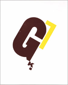
Uses of helveticaLast week I saw the documentary Helvetica at a special screening at Arion Press in the Presidio in San Franciso. Helvetica is a typeface introduced in 1957 as an antidote to old-fashioned type styles, and it quickly became ubiquitious. Even after 50 years it continues to be used for countless logos and signs (like the examples to the right) and even IRS tax forms.
Overlong but lively, the movie presents the typeface as an emblem of modernity, simplicity and abstraction. The designer talking heads in the film were divided about its popularity and use — from love (“most neutral typeface”) to hate (it’s representative of the Vietnam & Iraqi wars). I find the face too bland and prefer using Gill Sans (there were other votes in the audience for Univers). But the upshot of the movie for me is that I’ve spent the last few days scanning signs to see if they use Helvetica!
(There were many quotable quotes by the designers in the film. But the one I liked best came before the screening, when Andrew Hoyem, the owner of Arion, read an op ed piece he’d written for the Los Angeles Times on the 50 anniversary of Helvetica — “You might think of sans-serif typefaces as skeletons of letterforms, without flesh or clothing.”)

Mind Your Ps & Qs

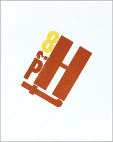
Mind Your Ps & QsNo one seems to know exactly where the idiom “mind your Ps and Qs” originated, but I’d like to believe that it came from advice to typesetters. In letterpress printing, words are composed metal type letter by metal type letter, left-to-right, with each letter inserted upside down. For beginning typesetters, backward-facing letters are confusing, especially the mirrored lower-case letter pairs p and q, and b and d. And thus the advice to be alert and watch the details (“mind the ps and qs”).
In addition to the typesetting theory, there are many competing explanations — my favorite: an admonishment from a French dancing master to perform the dance figures pieds and queues correctly. Others include a variation on the typesetter advice, but to small children learning to write the alphabet, not to mix up p and q.
This article gives some more possible origins and then clears up the mystery: “Investigations by the Oxford English Dictionary in 2007 when revising the entry turned up early examples of the use of Ps and Qs to mean learning the alphabet. The first is in a poem by Charles Churchill, published in 1763: ‘On all occasions next the chair / He stands for service of the Mayor, / And to instruct him how to use / His A’s and B’s, and P’s and Q’s.’ The conclusion must be that this is the true origin.”
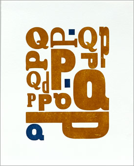
In my current project to feature my large wood type in my printing, my newest broadside uses only Ps and Qs. That’s it above.

Judging a Book by its Cover

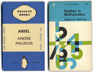
Pelican book covers by yearRecently I found a wonderful-to-look-at pictorial archive of Pelican book covers by year. Pelican is the non-fiction brand of Penguin Books and, according to Wikipedia, the idea behind the first paperback Penguin Books was to “provide quality writing cheaply, for the same price as a pack of cigarettes.” The publisher decided that design was essential to Penguin’s success, so the first covers, from the 1930s, were simple layouts that used two colors and Eric Gill’s sans serif for the typeface (like the “Ariel” cover to the right). Over time images and illustrations were added to the cover designs. As you might guess, I especially like the one for “Riddles in Mathematics” from 1953. See the entire archive here and read a good article about the history of Penguin’s book design on the Design Museum website.
One more nerdy bit for those like me interested in book design and page layout: Jan Tschichold was the designer at Penguin from 1947-49. He fashioned a template for all Penguin books called Penguin Composition Rules, a four page booklet of typographic instructions for editors and compositors. You can read them here. Jordon Harper adapted them to web writing here.