Giveaway: i prefer pi

pi_day.jpg

Pi (π) is the symbol for the ratio of the circumference of a circle to its diameter. Pi is celebrated every year by math and number enthusiasts around the world this coming Saturday, March 14th.
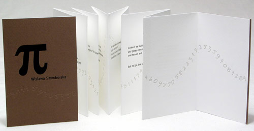
And what does π have to do with book arts or letterpress or type, you might ask? The first book I printed letterpress was a small artist’s book with Wislawa Szymborska‘s whimsical poem “Pi,” which juxtaposes the finite, impermanent world with the familiar never-ending sequence 3.1415926535… In my book the first 200 or so digits of Pi dance across the pages, starting on the cover and skating off the back.
In a toast to numbers and letterpress, I’m giving away a copy of my book. Just put a comment on this post by Sunday March 15th, and mention your favorite book with a number in the title or a number theme. I’ll pick a random name from the comments and announce the winner on Monday March 16th. My friend Richard, who suggested this question, told me his answers would be Life of Pi and A Tale of Two Cities.
You can read Szymborska’s poem, which begins “The admirable number pi: three point one four one.“, here. There’s an official (!) web site for Pi day with all sorts of fun facts and quotes and pointers to YouTube videos. And here’s a link to my book.

Cut Books


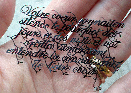
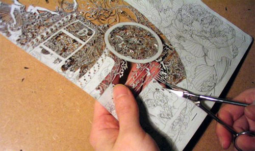
De Baudelaire au Surréalisme by Georgie RussellI don’t know why cut paper sculptures, especially involving books, are so fascinating to me — maybe because I’m in awe that anyone could do that amount of hand cutting! The specimen to the right is called “De Baudelaire au Surréalisme” by Georgia Russell, an artist in Scotland. See a gallery of her work here.

Tamar Stone’s Corset Books

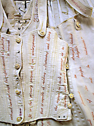
The upcoming issue of Ampersand includes Debbie Kogan’s profile of book artist Tamar Stone. She makes one-of-a-kind books using antique corsets, linens and beds as substrates, then embroiders them with original texts from women’s stories and writings (many from the 1800s). She says

Inspired by my own experiences [with wearing a brace to correct scoliosis as a teen-ager], my books capture moments in women’s lives when issues of appearance, self esteem and assimilation become paramount due to physical restrictions placed on the body, either by fashion or by medical necessity.

Her website is a treasure trove of photos of her work, and you can also read the texts she uses. Be sure to check it out. Below is a detail of one of her works, …to make her look her best (the White Corset Book) from 2002.

The White Corset Book by Tamar Stone

Detail of …to make her look her best (the White Corset Book) c. 2002
Antique Quilted Vest Corset, with bone buttons
Height: 10 1/2” (16” with shoulder straps)
Width closed: 11”
Width opened: 18 3/4”

Ink Coverage

white vs. silver ink coverageLast week I got an email from a student in one of my tabletop platen press classes asking about ink coverage — she was having trouble getting the ink to completely cover her image. The paper color was “mixing” with the ink color (actually showing through the ink) and the resulting color wasn’t what she expected. She tried using more ink on the press but then she got “ink squeeze” (the color squeezes out at the edge of the artwork or text making it look muddy). This is a common problem with smaller platen presses, especially the tabletop ones, and I encounter it often enough on my floor model press as it’s only an 8×12 C&P. I suggested a couple of things to try

  • double inking the rollers before striking the paper
  • double hitting the paper to get 2 layers of ink. This usually doesn’t result in ink squeeze problems.
  • a trick I learned from Maia de Raat: mix a bit of opaque white into the colored ink. The white usually adds just enough opacity so the paper color doesn’t interfere with the ink color; I’ve used this trick many times myself.
  • a more time consuming solution is one Eric Holub suggested to me — first print a thin layer of white, then the color over it.

As luck would have it, a few days later I ran across this great blog post on printing on black paper from Studio on Fire in Minneapolis. They explain why using silver metallic ink, rather than opaque white, on black paper provides much better coverage — and the dramatic images on the left show their results. On their blog they have more information including the effects on small type. And this suggestion:

Q: How can I know what my ink color will look like printed on a colored paper? A: We recommend using the “multiple” filter in Adobe Illustrator. It isn’t a perfect match but does give a good approximation.

The covers for my recently printed Sherlock Holmes notebooks are white printed on black paper and it was a lot of work to get the white to cover adequately. Lucky for me I already have silver metallic ink from another project — when it’s time to reprint the notebook covers I’m going to give silver a try.

New Prints

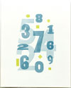
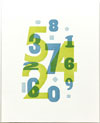
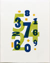
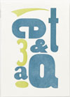
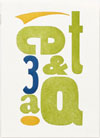
Whew! the wood type prints I made last week are now all titled, signed, numbered, photographed and listed on my website (and my shops on Etsy and Supermarket). Sometimes it feels like all that bookkeeping takes longer than actually making the prints! The titles are, from left to right: Make the Numbers Dance (this is the one for the letterpress swap), Countless, The Generostiy of Numbers, And Q and And Q Too. The first 3 are 8×10, the other 2 are 5×7. To see larger images, click on the thumbnails.