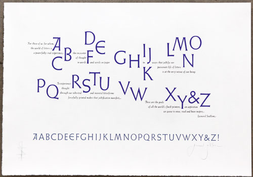
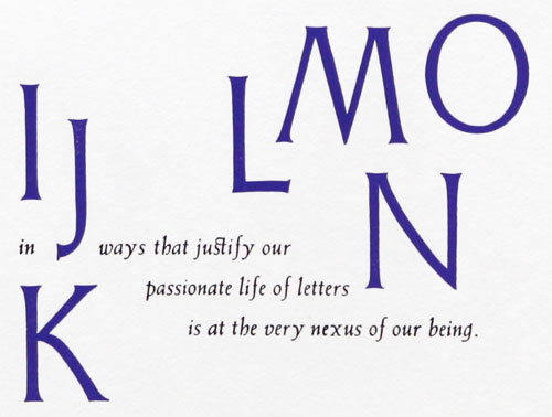
At the Codex book fair last February, Leonard Seastone had an ABC print that particularly interested me. I asked him if I could reproduce it for the upcoming Ampersand and in addition to saying “yes” he also sent me a wonderful email with some background on the broadside:
I have long admired some of Hermann Zapf’s broadsides with homage quotes to type design….So several years ago when Graham Moss, of the Incline Press, and I were fondly talking of the early to middle 20th century, German type designs Graham informed me of his intention to publish a book about Emil Rudolf Weiss (Weiß). He requested I design and print a broadside using any type designed by Weiss that would then be tipped into his publication. I readily agreed thinking to use my collection of Weiss Initials in several point sizes. I also envisioned a hand-set broadside in the style of that early gift to me. Eventually I focused on a display of Weiss Initials II. Using Weiss Italic for the text was selected almost without thought. But what should the text be?
My own written thoughts about type are few and largely unpublished. My written text on type sometimes seems to stylistically read like an attempt to channel Thomas Mann. But I do feel that type and books can approach the sublime and besides Graham is a great encourager and thought my words were quite appropriate….
The Incline Press Book on E.R.Weiss is due out this Autumn. This broadside…will be included. … I printed a few extra, all on Zerkal paper, as it was not an easy piece to set and compose by hand. I wanted a few that might exist free of the book format… the book format, which I do love, but which I realize remains closed for 99 percent of its life. Graham agreed to my printing extra and offering them outside the book. They are available for $35 + shipping.


