 One of the things I enjoy about teaching beginning letterpress is watching students discover the ligatures in the type case, especially the students with no graphic design background. (A ligature is a character or type combining two or more letters that would look too spaced out if printed separately, such as fl or fi.)
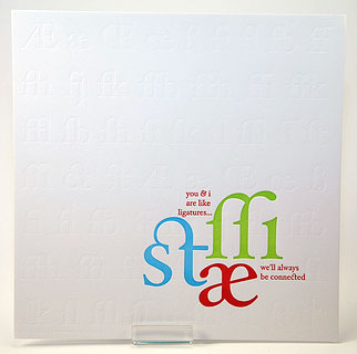
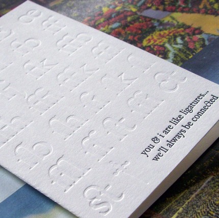
![]() One of the prints I got as part of a printer’s swap earlier this year is A. Favorite’s ode to ligatures, on the left. It’s hard to see all the ligatures she’s blind stamped in the background but she has a card, below, that shows off the blind stamping and highlights those beautiful ligatures.
One of the prints I got as part of a printer’s swap earlier this year is A. Favorite’s ode to ligatures, on the left. It’s hard to see all the ligatures she’s blind stamped in the background but she has a card, below, that shows off the blind stamping and highlights those beautiful ligatures.
![]() You can see more about what I like about teaching here.
You can see more about what I like about teaching here.

