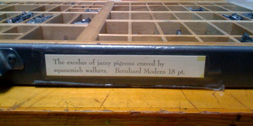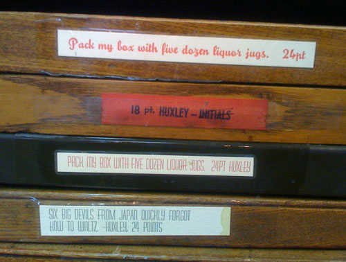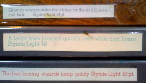
I taught beginning letterpress last Sunday at the San Francisco Center for the Book. I particularly enjoy watching the students select the type face to use for the cards they handset. This time one student chose to pair delicate Arrighi with a wonderful cut of a hen, and another paired a chunky gothic face with a printing block (cut) of a dragon. At the beginning of the day, as I’m setting up, I always check out the type cases to see if there’s anything new, and to read the pangrams. (A pangram is a sentence using every letter of the alphabet at least once. They give the student an idea of what the type in the case looks like — narrow, wide, chunky, small, large, serif or sans serif…) Here are some more examples…


