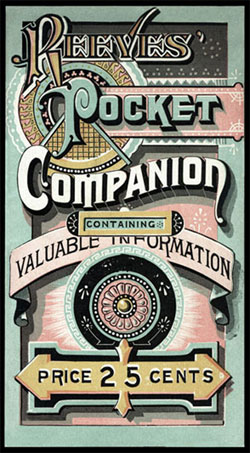
 Over on the Design Observer there’s a post by Eric Baker about “artistic printing” from the late nineteenth century. He says
“Practitioners of artistic printing subscribed to the belief that letterpress printers could and should develop their own sophisticated styles; that they should avail themselves of artfully arranged type; and that less could not possibly be more….To contemporary viewers, much of this work appears chaotic and overblown, out of step with modern opinion. Yet the best of this work endures, reminding us that a century ago, designers privileged excess, developing a body of work that relied upon a lively orchestration of mismatched form: from brass rules to floral ornaments to a myriad of deeply ornamental typefaces…”
There’s one example on the left. The examples are from the collection of Scottsdale, Arizona designer and collector Richard Sheaff. Do check out Sheaff’s website — it’s chock-a-block with history, photos and examples. Over the past several days, I’ve spent a very happy couple of hours reading and looking.

Oh! don’t forget our book, “The Handy Book of Artistic Printing: A Collection of Letterpress Examples with Specimens of Type, Ornament, Corner Fills, Borders, Twisters, Wrinklers, and other Freaks of Fancy”—a veritable Who What When and Why of artistic printing…
Where and How are also covered…