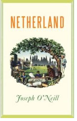
 This week I read Netherland, a recent novel by Joseph O’Neill. It’s about, among other things, cricket, and not books. But when I got to the end I was unexpectedly happy to turn to a page that contained only “A Note on the Type” and a wonderful note at that:
“This book was set in a modern adaptation of a type designed by the first William Caslon (1692-1766). The Caslon face, an artistic, easily read type, has enjoyed more than two centuries of popularity in the English-speaking world. This version, designed by Carol Twombley for the Adobe Corportation and released in 1990, ensures by its even balance and honest letterforms the continuing use of Caslon well into the digial age and the twenty-first century.”
Used to be most books had such notes, wish they still did.

I agree. Bring back the colophon! Reading is a joy with a well-made font and typographers and fontographers deserve a shout out for their efforts.
Me, too. But what did you think of the book? It’s gotten some over-the-top reviews. I read it on a plane, hungrily, in one sitting. The prose is almost poetic in places, and the story flashes with insights. I was surprised to find myself enchanted by the cricket. But ultimately I didn’t find the characters believable or memorable.
I read the book pretty much in one sitting too — I agree the characters were mostly forgettable. But the writing was wonderous. For a couple of days afterward it stayed with me, like a really fabulous meal.