This past week-end I took Carol Pallesen’s Tiny Handwriting workshop. In two days she taught us 3 alphabets and we made 3 tiny books. I signed up ostensibly to work on my own handwriting but I got a lot more. Best of all I discovered my handwriting isn’t all that bad if I slow down and enjoy the task! The first alphabet she showed us was a style of monoline italic lettering—letters written with a regular pen or pencil and that don’t have thick and thin lines as a calligraphic script would. She went over each letter of the alphabet, both upper and lower case (or, as Carol called them, majuscule and minuscule), showing us how to make the strokes and emphasizing the similarities in the various letters and the proportions we should try to maintain. Here’s an example of Nautilus Monoline Italic, which is similar to her alphabet.

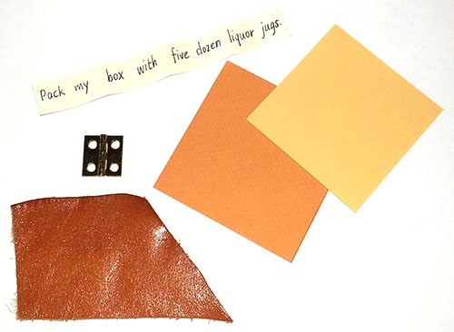
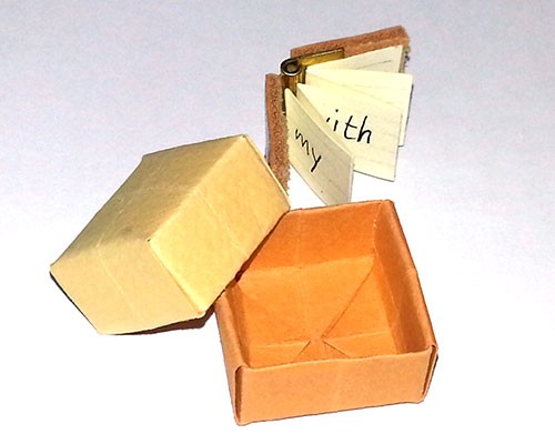
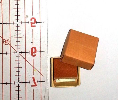
Over lunch I wrote a page of pangrams, trying to mimic her letters. “s” was really hard. And getting my letters to slant (she said about 5 degrees) was even harder as my habit is to write letters as vertical as possible. Then we made a little 3/4″ square book and a tiny origami box to put it in. The book was dead simple to make—the spine was made out of a tiny brass ornamental hinge from Home Depot and the covers from 2 little pieces cut from a scrap of leather. The inside was an accordion-folded strip of paper. Below are the pieces, and you can see my attempt at the monoline letters (the words are far apart as I put one word per panel of the accordion). Following that are the finished book and box. (I’ll write about the rest of the workshop over the coming week.)
Hi, With regard to the letter “S”, you may find it a help to know that the top “bowl” or curve of the letter is smaller at the top and larger at the bottom. This is to make the letter look balanced and the larger bowl carries the weight of the letter. This is what I teach my students. Hope this helps you and enjoy the journey of learning the art of beautiful writing. Best wishes, Sue in South Africa.
Sue: Thanks for hint! I just tried writing another line of S’s and see that I consistently make the top larger than the bottom. When I concentrated on making the top smaller, they look much much better. –Susan