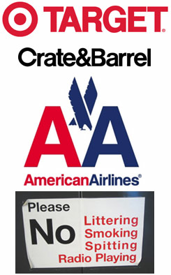
 Last week I saw the documentary Helvetica at a special screening at Arion Press in the Presidio in San Franciso. Helvetica is a typeface introduced in 1957 as an antidote to old-fashioned type styles, and it quickly became ubiquitious. Even after 50 years it continues to be used for countless logos and signs (like the examples to the right) and even IRS tax forms.
![]() Overlong but lively, the movie presents the typeface as an emblem of modernity, simplicity and abstraction. The designer talking heads in the film were divided about its popularity and use — from love (“most neutral typeface”) to hate (it’s representative of the Vietnam & Iraqi wars). I find the face too bland and prefer using Gill Sans (there were other votes in the audience for Univers). But the upshot of the movie for me is that I’ve spent the last few days scanning signs to see if they use Helvetica!
Overlong but lively, the movie presents the typeface as an emblem of modernity, simplicity and abstraction. The designer talking heads in the film were divided about its popularity and use — from love (“most neutral typeface”) to hate (it’s representative of the Vietnam & Iraqi wars). I find the face too bland and prefer using Gill Sans (there were other votes in the audience for Univers). But the upshot of the movie for me is that I’ve spent the last few days scanning signs to see if they use Helvetica!
![]() (There were many quotable quotes by the designers in the film. But the one I liked best came before the screening, when Andrew Hoyem, the owner of Arion, read an op ed piece he’d written for the Los Angeles Times on the 50 anniversary of Helvetica — “You might think of sans-serif typefaces as skeletons of letterforms, without flesh or clothing.”)
(There were many quotable quotes by the designers in the film. But the one I liked best came before the screening, when Andrew Hoyem, the owner of Arion, read an op ed piece he’d written for the Los Angeles Times on the 50 anniversary of Helvetica — “You might think of sans-serif typefaces as skeletons of letterforms, without flesh or clothing.”)

I can appreciate Helvetica’s “basicness”. Sometimes you just need a staple, nondescript, efficient font- and it comes in every style imaginable. This is your man for that. It does amaze me how many people can’t see past it sometimes though- there’s so many better and more suitable fonts for certain projects. There’s a good little book Helvetica- Homage to a Typeface by Lars Muller if you’re looking for something to add to your book collection.
It’s the pot-bellied lowercase “a” that always gets me. It’s just so darn cute (not something professionals are supposed to say about utilitarian typefaces, but there I said it). I know…I know…Helvetica is built to be a serious communicator, but don’t you just want to extend your pinkie finger and give that little “a” a poke in the gut?
When I wrote this post, I looked high and low for quotes from the movie, without much luck. But I keep looking. In the meantime, here’s a quote from an entertaining article in the BBC News Magazine discussing Helvetica:
Neville Brody, leading typographer and graphic designer: “When people choose Helvetica they want to fit in and look normal. They use Helvetica because they want to be a member of the efficiency club. They want to be a member of modernism. They want to be a member of no personality. It also says bland, unadventurous, unambitious.”