When I started this blog last year to record my attempts at making broadsides, my thought then was to play with combining typefaces, letterpress, text and maybe images on paper. Looking back a year later, “images” turned out to be abstract patterns, shapes and letterforms. And a lot of my broadsides don’t have text (a surprise to me!), rather I used wooden type in nonsense patterns. I’ve been calling these later prints “wood type collages” (you can see them all here.)
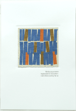
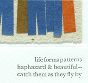
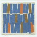
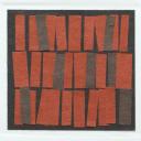
![]() Since the beginning of this year, I’ve been experimenting with another type of collage using paper (wonderful Japanese stuff called moriki), and I thought I might combine some of them with poetry for a new set of broadsides. These have a hand-debossed (recessed) panel for the collage, and a haiku is letterpress printed below them. I’ve handset the type — which made for a very lovely, meditative morning recently. I’ve printed the same haiku on about 15 sheets of chewy Somerset, and debossed the panels. Then I’ll make a unique collage for each one. I’ve done four so far (see photos at the top of this post). A finished broadside is shown below. See them all here.
Since the beginning of this year, I’ve been experimenting with another type of collage using paper (wonderful Japanese stuff called moriki), and I thought I might combine some of them with poetry for a new set of broadsides. These have a hand-debossed (recessed) panel for the collage, and a haiku is letterpress printed below them. I’ve handset the type — which made for a very lovely, meditative morning recently. I’ve printed the same haiku on about 15 sheets of chewy Somerset, and debossed the panels. Then I’ll make a unique collage for each one. I’ve done four so far (see photos at the top of this post). A finished broadside is shown below. See them all here.
 |
 |

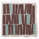
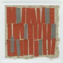
Mmm- I really like these. I’m a big fan of abstract and color driven pieces.
Wow! these are truly lovely! I love the combination of printing and paper. Colors are fantastic also.
I know it’s abstract, Ms. Chair, but they look like the spines of books to me. It’s always fun to see a jumble of spines in a bookcase. Nice work and wonderful palette.
Aha! Kate and I are in agreement. I was going to say (I am saying) that the first thing that leaped to mind as I looked at the collages was book spines. Do other people “read” things in abstracts?