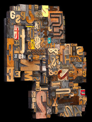
 Douglas Morgan, a Collector of Typefaces, Dies at 75
That’s the intriguing title of the obituary in the New York Times last Monday (written by Steven Heller).
“Mr. Morgan began acquiring antique wood types in the 1950s… These woodblock letters and fonts were commonly used in the mid- to late-19th century for advertisements, posters and handbills. Darker and larger than more delicate metal typefaces, they are familiar today as the bold lettering on vintage western wanted posters. Yet many classic wood type variations were intricately ornamental, used to grab the attention of passers-by in an increasingly cluttered advertising environment.
But simply being a connoisseur of the wood type letterforms was not challenging enough for Mr. Morgan. In the late 1950s his company sold the type to designers, inspiring the rise of an ornately Victorian retro style in the graphic arts.
Among the designers that acquired the letterforms was Push Pin Studio in New York, which at the time was rejecting the cold uniformity of Modernist designs in favor of more eclectic revivalist styles. A studio member, John Alcorn, interpreted the Victorian decorative pastiche in his “Wood and Foundry Type” catalogs, which are now collectors’ items.
The Morgan collection, including type and printers ornaments, is housed today at the Smithsonian National Museum of American History, in the Hall of Printing and Graphic Arts.”
I collect wood type myself, so Mr. Morgan is a kindred spirit. A bit of Google searching reveals that the “Hall of Printing and Graphic Arts” at the Smithsonian was put into storage in late 2003. Very sad. But in my search for more info on the Morgan collection I happily stumbled upon Lloyd Schermer’s wood type sculptures (that’s an example above).

“In Storage”, humpf! Isn’t the Smithsonian aware that there is a printing renaissance going on?
So beautiful. I have so many, I’ve long lost count. I’d like to make a table top with them someday. They won’t be glued down though. i want guests to be able to play with them and rearrange them. Each piece has so much character.
gosh. that typeface sculpture is divine! i want it. 🙂