 In a recent post about colors and names, I mentioned that I mix colors using the Pantone (nameless) color system. Well, turns out I was wrong about the nameless part — Pantone does name their colors. And even gives them attributes. An article last month in the New York Times reports that annually Pantone annoints a “color of the year,” and for 2008 it’s a purple-blue hue they call “Blue Iris.” The Pantone press release says “Blue Iris combines the stable and calming aspects of blue with the mystical and spiritual qualities of purple, and satisfies the need for reassurance in a complex world, while adding a hint of mystery and excitement”.
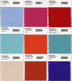
![]() To the right are their color choices since 2000, although I’m surprised by the lack of green, as my green wood type prints are always my most popular.
To the right are their color choices since 2000, although I’m surprised by the lack of green, as my green wood type prints are always my most popular.
What an interesting post about Pantone. I would have guessed green too 🙂