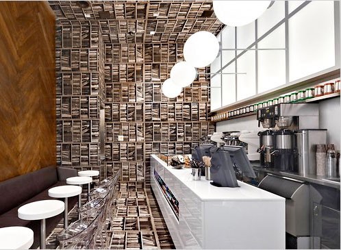
I had to laugh at this article about the decor in D’Espresso’s coffe bar in NYC. According to the article, the owner “told his designer, ‘Let’s do a coffee bar that looks like a library, but would be more interesting.’“ So the designer made a room tipped on its side — one wall is covered in oak flooring, the ceiling, floor and rear wall are tiled with an image of bookshelves (on their side). Is that “more interesting?” Cute maybe, but much as I like coffee, guess I’d rather go to a real library… (Photo below by Elaine Louie.)

