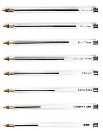
 Matt Robinson and Tom Wrigglesworth took “a selection of the most commonly used typefaces (to) compare how economical they are with the amount of ink which they use at the same point size. Large scale renditions of the typefaces were drawn out with ballpoint pens, allowing the remaining ink levels to display the ink efficiency of each typeface.” See them drawing here. (Found here.)

Very interesting little experiment and nicely presented results too I must say…
And not only is Garamond a very classy little font but its kinder to the environment…