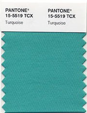
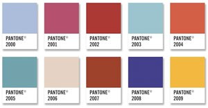
 Finally a green — Pantone’s color of the year for 2010 is turquoise. They claim it “transports us to an exciting, tropical paradise while offering a sense of protection and healing in stressful times.” A little over the top, don’t you think? But it is the first green tone that Pantone has selected — the swatches from the past 10 years are below (the color from 2005, first on the left in the second row is “Blue Turquoise”…). Read the entire press release here.


I have always been drawn to the color turqouise and then after living in Phoenix for some years…collecting turquoise jewelry , etc…..now I live where we get lots of snow and cold and turquoise really does transport me right back to warmth
and just a good overall great feeling. Who says color therapy doesn´t work ;))
I also love turquoise and any sort of green/blue mixture! It’s surprising how you can find it in both warm and cool climes. Last week here in St. Paul, as I was walking around the small lake near my home at sunset, the ice (which was still clear of snow) turned a beautiful soft aqua color for a few moments.