Paper from Flags and Southern Fictions

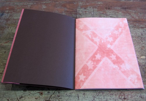
The table next to mine at Codex was Horse and Buggy Press, from Durham, North Carolina. Dave designed and printed a lovely book of sonnets by Kathryn Stripling Byer called “Southern Fictions.” The sonnets reflect on the racial conflict in Southwest Georgia when Byer was growing up during the Jim Crow era. Dave hand-made some of the paper, including the cover and front piece (below) out of confederate flags. He has a nice blog post about making the paper and printing the book here.

Front piece from Southern Fictions

Modern Methods of Book Composition

I have an early Kindle. It displays one and only one font (roman only) and no graphics. One of the first books I bought to read on it used italics to denote which character was speaking, which was lost on me, and made the book very confusing. Later, before I learned my lesson for good, I got a history book that had maps & charts in the printed version but not the Kindle version. That one was so confusing I gave up and got the print version from the library. So I really enjoyed Modern Methods of Book Composition, an artist book by Tim Schwartz that I saw at Codex today. According to Tim’s website:

Theodore Low De Vinne is one of the fathers of book publishing in America. He was one of the nine founders of the Grolier Club, the commissioner of the font Century, and the most prolific writer on book publishing methods in the late 19th century. In 1904, De Vinne wrote “Modern Methods of Book Composition,” a treatise on how to layout and publish books.

In 2007 the University of California Libraries scanned in the pages of this book and uploaded the files to archive.org…After the files were uploaded the content of the book was automatically extracted and a variety of digital book formats were created, including one for the Kindle.”

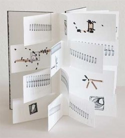
Of course the figures and illustrations were stripped from the Kindle version. Tim printed the scanned version, and redacted much of the text, leaving pretty much only the illustrations. He says

A piece of software was written to take a page from the original book and cover up any content that was extracted with a black box. By repeating this process for every page in the original book, a new book was created that shows only the layout of the original book, that was lost in the digital copy, and leaves uncovered the content that was unable to be converted into the digital version.

Then he packaged this version with a Kindle with the non-illustrated text. Making, I suppose, a complete book. Here’s a picture of it. See more here.
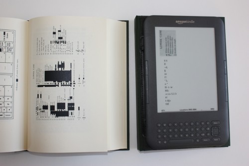
Modern Methods of Book Composition by Tim Schwartz

Mein Blaues Klavier

even-mein-blaues-klavier-s.jpgI’m at Codex this week, and there’s so much to see! One unusual book, from Even Hoshen Press, is called Mein Blaues Klavier and described on the Vamp and Tramp website as “…a tiny blue grand piano. It cannot play, but is equipped with a keyboard cover and a top that opens to reveal taut strings. On its removable paper ‘keys,’ Agassi has printed in Hebrew and German a poem by the German writer Else Lasker-Schüler titled, ‘Mein Blaues Klavier’ (‘My Blue Piano’).” See more from the Evan Hoshen Press here and read My Blue Piano here

Kevin Steele

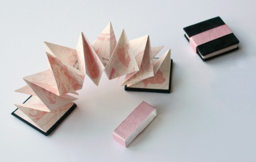
Naughty But Nice by Kevin Steele

I spent some more time looking through the designs on French Sample Room and found this turkish map fold book by Kevin Steele. It’s called “Naughty but Nice” and he says

In this tongue-in-cheek book, suggestions on social etiquette are contrasted with naughty illustrations in which the subjects have bypassed all formality of manners, in varying states of undress. Text excerpts are from social etiquette books, 1847-1950. Illustrations are from French spot and romance illustrations of the same era.

It’s a miniature book (1-1/2″x1-1/2″) and letterpress printed on both sides, too.

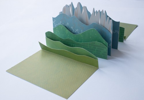
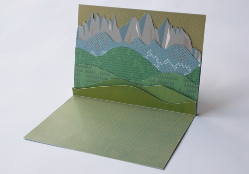
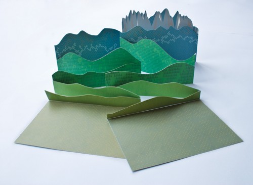
This lead me to his website and this really wonderful modified tunnel book. He calls it an “accordion book featuring a repositionable Alpine landscape.”

Kevin Steele: Val di Funes / Villnöss

Kevin Steele: Val di Funes / Villnöss

Kevin Steele: Val di Funes / Villnöss

Laura Davidson

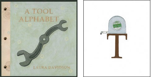
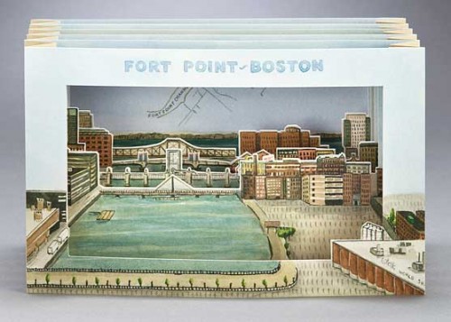
I ran across book artist Laura Davidson’s web site the other day. She says “maps, art history, travel, architecture and her love of birds are recurring elements in her visual vocabulary.” Some of her books showcase her drawings, such as the Tool Alphabet below. She also has pop-ups and tunnel books (see pictures below).

Laura Davidson’s Tool Alphabet
Tool Alphabet

Fort Point – Boston, Laura Davidson
Fort Point—Boston

Mapping My World – buildings & bridges, Laura Davidson
Mapping My World – buildings & bridges