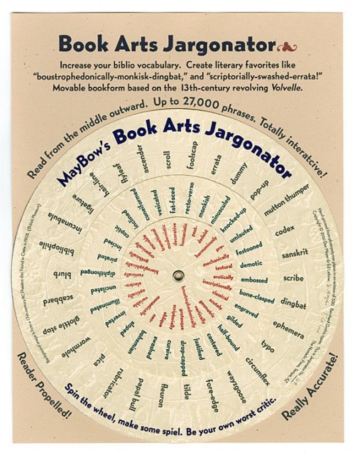
The other day I noticed that Hamilton Wood Type Foundry was selling a new digital font—HWT Catchwords. The font is described as
Catchwords have always been offered alongside standard alphabets in wood type catalogs and so often appear on posters as a decorative punch that they have become part of the wood type vernacular. Words like ‘The’, ‘And’, ‘To’, ‘For’, and less common abbreviations could be inserted into a design along with decorative ornaments or stars when space was tight or to add variety in the design. HWT Catchwords features over 80 words based directly on designs offered by Hamilton and other wood type manufacturers of the 19th and early 20th Century.
My small woodtype collection doesn’t have any of these, and I didn’t know the term “catchword.” Wikipedia defines the term a bit differently:
A catchword is a word placed at the foot of a handwritten or printed page that is meant to be bound along with other pages in a book. The word anticipates the first word of the following page. It was meant to help the bookbinder or printer make sure that the leaves were bound in the right order or that the pages were set up in the press in the right order. Catchwords appear in some medieval manuscripts, and appear again in printed books late in the fifteenth century. The practice became widespread in the mid sixteenth century, and prevailed until the arrival of industrial printing techniques late in the eighteenth century.
Theodore Low Devinne’s 1901 guide on Correct Composition had this to say:
For more than three centuries printers of books appended at the foot of every page the first word or syllable of the next page. This catchword was supposed to be needed by the reader to make clear the connection between the two pages ; but the catchword is now out of use, and it is not missed.
By the way, this last quote is from a book with the hugely long title: The practice of typography; correct composition; a treatise on spelling, abbreviations, the compounding and division of words, the proper use of figures and numerals, italic and capital letters, notes, etc., with observations on punctuation and proof-reading. And it’s available to read online here.
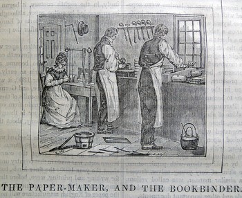 The Princeton University Library blog has a nice post of illustrations from a book in their collection, Edward Hazen’s The Panorama of Professions and Trades, or, Every Man’s Book. It includes the illustration above, as well as the entire process of making abook from “The Author” to “The Type-Founder” to “The Bookseller”. See them all here. The entire book is available to view online here.
