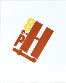
 Wow! Did I ever hit the jackpot! So many great poems were submitted to my giveaway celebrating National Poetry Month. Lots of poets and verse I hadn’t read — good thing I didn’t make the criteria “my favorite” and instead selected a name out of a hat! As one entrant emailed me “selecting a favorite poem is akin to naming one’s favorite child! It simply can’t be done.”
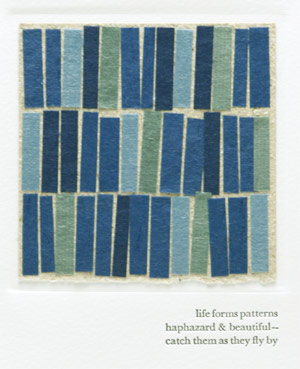
And the winner of my broadside is Lauren, at one {crafty} writer, who submitted Mark Strand’s Coming to This.
Thanks again to everyone! Here’s a poem I would have submitted, one I never tire of:
Numbers
Mary Cornish
I like the generosity of numbers.
The way, for example,
they are willing to count
anything or anyone:
two pickles, one door to the room,
eight dancers dressed as swans.
I like the domesticity of addition —
add two cups of milk and stir —
the sense of plenty: six plums
on the ground, three more
falling from the tree.
And multiplication’s school
of fish times fish,
whose silver bodies breed
beneath the shadow
of a boat.
Even subtraction is never loss,
just addition somewhere else:
five sparrows take away two,
the two in someone else’s
garden now.
There’s an amplitude to long division,
as it opens Chinese take-out
box by paper box,
inside every folded cookie
a new fortune.
And I never fail to be surprised
by the gift of an odd remainder,
footloose at the end:
forty-seven divided by eleven equals four,
with three remaining.
Three boys beyond their mothers’ call,
two Italians off to the sea,
one sock that isn’t anywhere you look.
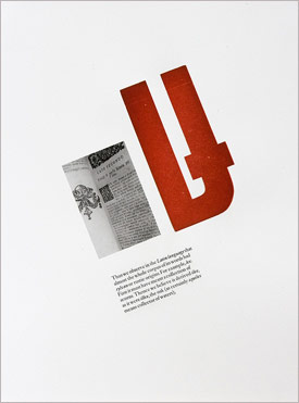
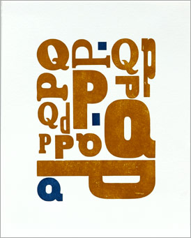
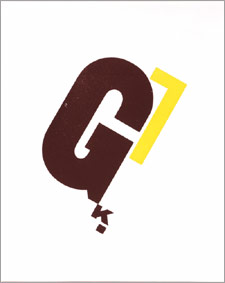
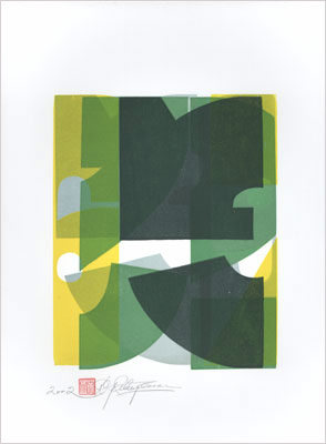 Dennis Ichiyama is a former Designer-in-Residence at the Hamilton Wood Type and Printing Museum and currently Professor of Art and Design at Purdue University. Of his experiments with pieces of broken wood type and lead rules, he says “I’m just picking letters and colors and playing with them.” To create his prints, he starts with 25 sheets of paper and then layers colors on top. “When I get tired, when I don’t know what else to do, I stop,” he says. “And by the time I’m done, I usually end up with about 15 that I think are good.” That’s one of Ichiyama’s prints to the left. You can see lots more here. (First seen on Colour Lovers Blog)
 Wow! Did I ever hit the jackpot! So many great poems were submitted to my