Steamroller Prints

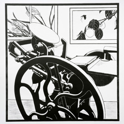
Patricia Curtan’s roadworks printEvery fall, the San Francisco Center for the Book asks local artists to create a design that is then cut into a 48 inch square piece of linoleum. The designs are printed using a large (3-ton) steamroller at the SFCB annual street fair and it’s quite a sight. I am particularly enamored of one of the prints this year — that’s it to the right. It’s by Patricia Curtan (who you might know from illustrations in Chez Panisse cookbooks) and looks just like my own press. It’s to be auctioned on Nov 7th at an SFCB fund raiser — oh how I wish it came in a smaller size that I could afford!
See the steamroller printing in action here. There’s more about Patricia Curtan here. Also, on her website, she has a lovely illustration of the progression of printing a multicolor block print (roll over the number sequence at the right of this page to see the progression). You can see all the steamroller prints from this year here.

Broadsides for Obama

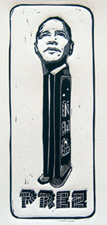
Prez by Eric RewitzerI’ve run across quite a few broadsides about Barack Obama — seems his candidacy has inspired a lot of artists. Obama’s campaign even has an Artists for Obama store with art donated to the campaign to help with fund raising.
My favorite is the linocut to the left, by Eric Rewitzer of 3 Fishes Studio here in San Francisco. I met Eric recently when he and his wife Annie took my letterpress class at the San Francisco Center for the Book. Eric was wearing a t-shirt with his design (I’ve got a weak spot for Pez dispensers — probably I caught my enthusiasm from my sister, who discovered & took me to the Pez museum I didn’t know exsited right here in my town of Burlingame).
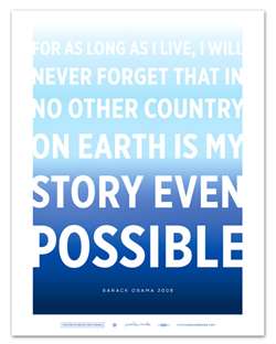
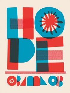
I like the two below because they are just typographic. The one to the left is by Jonathan Hoefler. (Hoefler and his partner Frere-Jones have an interesting blog about typography.) To the right is by Cody Hudson. Eric’s t-shirt is available here.

Possible by Jonathan HoeflerObama Poster by Cody Hudson

Large Prints

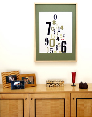
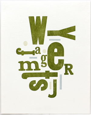
Several people have asked me about doing bigger prints with my wood type. I’m experimenting with 16×20″ reproductions of my original letterpress prints. I’ve now got four different designs in my shop. They are printed on thick white Lettra and printed on a high-end Epson printer. Take a look at them here.
The Weight of Numbers

Simple Pleasures

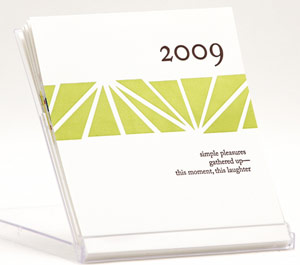
2009 Calendarsimple pleasures
gathered up—
this moment, this laughter

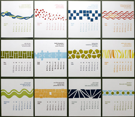
I’ve finished printing my 2009 calendar. For me, much of what makes life great is the series of simple encounters and observations I have every day — from the smell of freshly dug dirt when I’m working in my garden to watching a formation of pelicans flying over the bay near my house to catching a glimpse of a saffron colored sky at sunset. So this year my desktop calendar has 12 unbound letterpressed cards, one for each month of 2009, celebrating those moments with a haiku poem about life’s simple pleasures.
Here’s a thumbnail of all the months (click on it to see a lot more detail). The calendar is for sale on my webite ($20 + shipping).

2009cal-all-small-web.jpg

American Craft Show in San Francisco

Turning in CirclesI’ve got a table in the “AltCraft” section of the American Craft Show in San Francisco next weekend (August 15-17). It’s by far the biggest fair I’ve participated in, and for the past several weeks my days have been full of bookmaking and printing and getting my table props ready. I really don’t know what to expect — my books and prints aren’t the usual wares at this show, but it’s juried, the “AltCraft” tables weren’t too expensive, and I applied because it looked like a good opportunity to introduce my things to another audience. Now I figure if I don’t sell much, I won’t have to make anything else for the upcoming holiday season!
To the right is my latest wood type broadside, printed especially for this show, and just finished yesterday. It’s called “Talking in Circles.”
If you happen to go to the show, please do stop by and say hello!

Spring 2008 Ampersand

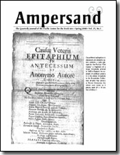
2008 Spring PCBA AmpersandThe Spring 2008 issue of Ampersand (the book arts journal I edit) is just out. In this issue, Charles Brownson, a retired librarian who often comments on the book arts list, contributes an article about what information to include in artists’ book colophons and Sarah Feingold, the lawyer for Etsy, helps demystifies copyright permission, in particular can you use the illustrations from an old book in your own artwork.
If I had to pick a favorite article in this issue, I guess it would have to be Theresa Whitehall’s Broadsides: Interactive Literature, a layman’s history of broadsides. She talks about a well-known local (San Francisco) printer, Jane Grabhorn, who was quite eccentric and practiced “her own brand of typography which was irreverent, humorous and cranky, by all accounts. For a while she promoted the idea that hyphens at the ends of lines were ludicrous. A word that needed to be split should simply break and begin again on the next line.”
You can see a list of all the articles in this issue here as well as order a copy.