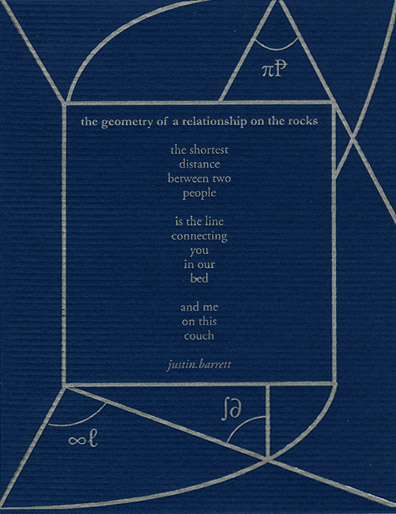
When I teach beginning letterpress at SFCB, I start the class off by asking everyone why they want to learn to print. Many are graphic designers wanting to get their hands dirty by doing non-computer typographic work. But occasionally I get a student like Kim who has no type design background but wants to print for other reasons. Kim learned letterpress printing in order to participate in the Guerilla Poetics Project — a group dedicated to propaging a love of poetry. They letterpress print small (4-1/4″ x 5-1/2″) poetry broadsides that they then insert (smuggle is their term) into books in bookstores & libraries, to be found and enjoyed by the unsuspecting reader. (They encourage you to report finds to their website.)
 Last Sunday I gave Kim a private lesson, teaching her the ins and outs of a floor model platen press. Since her first class with me on the tabletop press, she’s taken more letterpress classes and on her own hand-set and printed a small poetry broadside for the Obama inauguration. She brought her broadside to show me along with some other examples, and we spent a lovely morning printing.
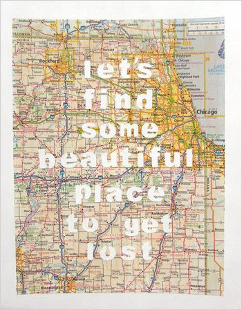
 Do check out their website… I particularly like the poem and broadside below (the geometry of relationship on the rocks by Justin Barrett).

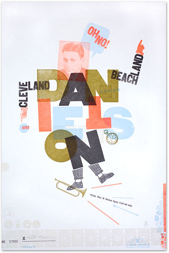 My post earlier this week on an article about letterpress in Forbes and Kate’s comments got me to thinking about my own taste in letterpress posters. The main inspiration for my own wood type collage prints was a lecture I attended where Alastaire Johnston talked about the work of H N Werkman (I have a post about his calendars here). Werkman’s broadsides seem so spontaneous — he printed with anything he could find in his studio, including furniture. But it is definitively sloppy and probably over-inked printing.
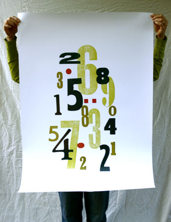 Last year a company in England that makes posters contacted me about proposing one of my wood type collages to Ikea… they would reproduce my original, make and supply the prints, I would get a royalty. I figured I had nothing to loose and sent off a proof for them to scan and forgot about it. Much to my surprise, Ikea selected my print, and in a huge size — almost 26×40. I got a proof the other day — that’s it to the right — and they should be available in Ikea stores in October!
