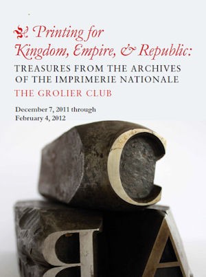
 There’s a really nice article about the current exhibit at the Grolier Club in NYC, “Printing for Kingdom, Empire & Republic: Treasures From the Archives of the Imprimerie Nationale.” Don’t miss the slide show of some great pictures of old type.
 There’s a really nice article about the current exhibit at the Grolier Club in NYC, “Printing for Kingdom, Empire & Republic: Treasures From the Archives of the Imprimerie Nationale.” Don’t miss the slide show of some great pictures of old type.
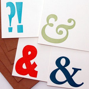 This is a set of 4 flat (A2 or 5-1/2″ x 4-1/4″ or 42cm x 59.4 cm) note cards. Letterpress printed by hand on my 1890s vintage press on thick off-white paper, using wood type and photopolymer. Three of the cards have ampersands in red, green and teal, the fourth a question mark and exclamation point in sky blue. Click here for more information.
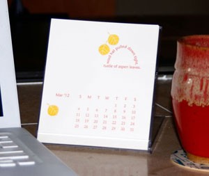 Yeah — I’m all done. Here’s my 2012 calendar…
My inspiration this year is the quote I included on the cover:
“Excellently observed,”
answered Candide;
“but let us cultivate our garden.”
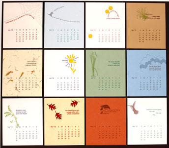
All the months are pictured below — click here to see a much larger photo. You can order a copy here.
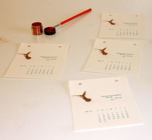 Applying the powdered pigment 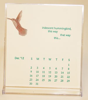 The finished calendar page |
One of the haiku for my 2012 calendar starts “iridescent hummingbird” so I wanted the illustration that goes along with the poem to sparkle. |
Before I converted one of my magnetic bases to take plastic plates, I bought a base from Boxcar. So I was able to compare them while printing my calendar. Most pages have 2 colors, so one base is for the first color and the second I used to register the artwork in the second color to the first color. Using the transparent plastic plates with the gridded bases has made setup and registration much easier. The pictures below are for one of the pages with fairly tight registration. I put 2 registration marks on the artwork (the little crosses you see in the 2nd and 3rd pictures). I got the first color all set up (the text and calendar), then registered the flower stem and petals on the second base in the same color. Once I was done with that, I cut off the registration marks, printed the first color (violet), cleaned the press, reinked in yellow and printed using the second base. The results are in the 4th picture below.
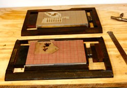 2 chasses |
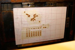 first base with haiku and calendar |
 flower to be registered against first base |
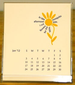 finished printed calendar page |