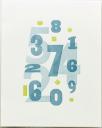
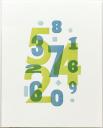
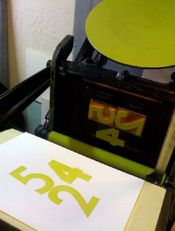
 Last week I got an email from a student in one of my tabletop platen press classes asking about ink coverage — she was having trouble getting the ink to completely cover her image. The paper color was “mixing” with the ink color (actually showing through the ink) and the resulting color wasn’t what she expected. She tried using more ink on the press but then she got “ink squeeze” (the color squeezes out at the edge of the artwork or text making it look muddy). This is a common problem with smaller platen presses, especially the tabletop ones, and I encounter it often enough on my floor model press as it’s only an 8×12 C&P. I suggested a couple of things to try
- double inking the rollers before striking the paper
- double hitting the paper to get 2 layers of ink. This usually doesn’t result in ink squeeze problems.
- a trick I learned from Maia de Raat: mix a bit of opaque white into the colored ink. The white usually adds just enough opacity so the paper color doesn’t interfere with the ink color; I’ve used this trick many times myself.
- a more time consuming solution is one Eric Holub suggested to me — first print a thin layer of white, then the color over it.
As luck would have it, a few days later I ran across this great blog post on printing on black paper from Studio on Fire in Minneapolis. They explain why using silver metallic ink, rather than opaque white, on black paper provides much better coverage — and the dramatic images on the left show their results. On their blog they have more information including the effects on small type. And this suggestion:
| Q: How can I know what my ink color will look like printed on a colored paper? A: We recommend using the “multiple” filter in Adobe Illustrator. It isn’t a perfect match but does give a good approximation. |
The covers for my recently printed Sherlock Holmes notebooks are white printed on black paper and it was a lot of work to get the white to cover adequately. Lucky for me I already have silver metallic ink from another project — when it’s time to reprint the notebook covers I’m going to give silver a try.

