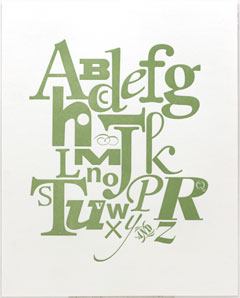
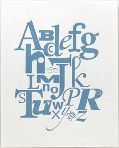
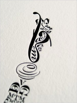
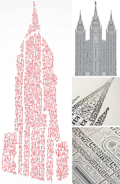
 Forbes.com recently had an article about the revival of letterpress printing. They mention Hatch Show Print, a print shop in Nashville that’s been making entertainment posters (“show posters”) since 1979 (that’s one of their prints to the left, you can see more here).
 It’s a breezy short article. And amusing in that it ends with a discussion of the debate on whether using photopolymer plates to print is really letterpress. Several of the commenters to the article say it isn’t letterpress unless the printer uses hand-set metal type. The Beast Pieces blog has a good counter-argument here.
 At SFCB, our beginning letterpress courses all teach hand type setting — but that’s because, in a studio already stocked full of metal type, it’s the easiest, cheapest way to start learning. But anyone who continues usually wants to design pieces that can be difficult, time consuming and costly to print hand-set, so my recommendation for a follow-on class is always the Printing from Photopolymer Plates class.
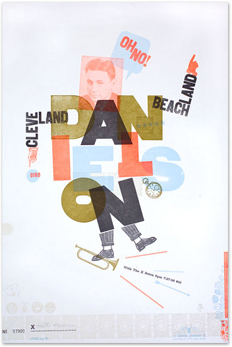 My post earlier this week on an article about letterpress in Forbes and Kate’s comments got me to thinking about my own taste in letterpress posters. The main inspiration for my own wood type collage prints was a lecture I attended where Alastaire Johnston talked about the work of H N Werkman (I have a post about his calendars here). Werkman’s broadsides seem so spontaneous — he printed with anything he could find in his studio, including furniture. But it is definitively sloppy and probably over-inked printing.

