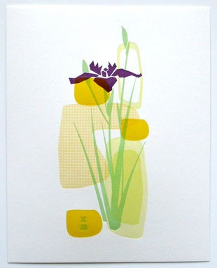
 One of the prints I liked best in the printer’s swap I participated in earlier this year is this print of an iris by Hijiri. On her blog, she has several posts on the process of making the print, from inspiration to printing to finish…
 One of the prints I liked best in the printer’s swap I participated in earlier this year is this print of an iris by Hijiri. On her blog, she has several posts on the process of making the print, from inspiration to printing to finish…
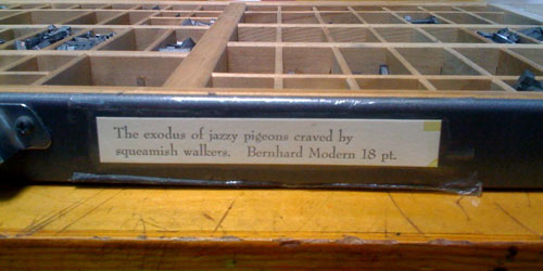
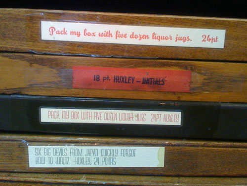
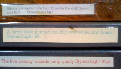
I taught beginning letterpress last Sunday at the San Francisco Center for the Book. I particularly enjoy watching the students select the type face to use for the cards they handset. This time one student chose to pair delicate Arrighi with a wonderful cut of a hen, and another paired a chunky gothic face with a printing block (cut) of a dragon. At the beginning of the day, as I’m setting up, I always check out the type cases to see if there’s anything new, and to read the pangrams. (A pangram is a sentence using every letter of the alphabet at least once. They give the student an idea of what the type in the case looks like — narrow, wide, chunky, small, large, serif or sans serif…) Here are some more examples…

This winter I made a print for a Letterpress Print Exchange. That’s mine below left. Poppytalk is hosting a giveaway of some of the prints — just look at the websites of participants in the swap and put a comment about one of them on this post. (Winners will be chosen this coming Friday.) You can see all 38 prints here.
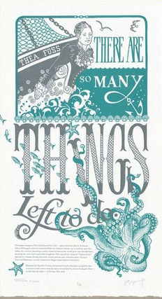 Anagram Press and Springtide Press in Tacoma Washington have teamed up to print a series of “feminist broadsides” — that’s the latest to the left. It’s got a quote by Thea Foss, who founded the Foss Tugboat company in Tacoma. Each one has a quote and a short history of the woman quoted — for Foss:
Norwegian immigrant Thea Christiansen Foss (1857 – 1927) arrived by train to Tacoma in 1889 as Washington achieved statehood. While her husband Andrew was at work she spent five dollars on a rowboat, launching a marine transport business that would grow into Foss Maritime, operating the west coast’s largest fleet of tugboats. Thea inspired the character “Tugboat Annie” featured in a “Saturday Evening Post” series, motion pictures and a television show. Tacoma’s Thea Foss Waterway is an inlet connected to Puget Sound named in her honor.
Others in the series are
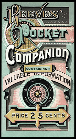 Over on the Design Observer there’s a post by Eric Baker about “artistic printing” from the late nineteenth century. He says
“Practitioners of artistic printing subscribed to the belief that letterpress printers could and should develop their own sophisticated styles; that they should avail themselves of artfully arranged type; and that less could not possibly be more….To contemporary viewers, much of this work appears chaotic and overblown, out of step with modern opinion. Yet the best of this work endures, reminding us that a century ago, designers privileged excess, developing a body of work that relied upon a lively orchestration of mismatched form: from brass rules to floral ornaments to a myriad of deeply ornamental typefaces…”
There’s one example on the left. The examples are from the collection of Scottsdale, Arizona designer and collector Richard Sheaff. Do check out Sheaff’s website — it’s chock-a-block with history, photos and examples. Over the past several days, I’ve spent a very happy couple of hours reading and looking.
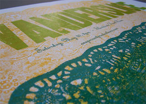 Instead of cutting a block or making a polymer plate, Bennett Holzworth used paper doilies from the local craft store to create a pattern to print letterpress. The doilies were glued 5 high, varnished, mounted on a board to make them type high, and then he cut a design in the middle of the doily. You can see photos of the entire process, from doily package to layout to final print, here.