I shot the serif…

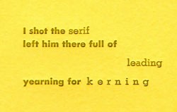
ishottheserif.jpgAt SFCB, I teach primarily beginning letterpress. Students have so much new stuff to learn — locking up a chase, using a pica pole, setting metal type, where everything is in the studio — that there’s no time to do anything fancy with the quotes they print. Only one font face at a time, maybe an in-line dingbat. But when I get to teach an advanced class, as I did this past Sunday, the students have enough experience to play around more with type. Nicole brought several haiku from a contest in honor of the documentary Helvetica and set and printed the one shown above. Below is the one she wanted to do, but unfortunately we don’t have Helvetica in metal at SFCB! (You can see all the haiku here.)

Helevetica sits,
watching you try the new fonts.
It knows you’ll be back.

Non Libri Sed Liberi

non libri sed liberti
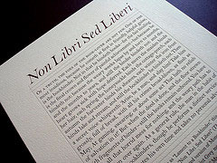
Gerald Lange, of The Beieler Press, printed this broadside with an excerpt from Kenneth Grahame’s essay from 1898 (Grahame also wrote The Wind in the Willows). This particular paragraph is often referred to as the “Lament to a Bookbinder.” Lange used a digital version of Monotype Bell that he altered to work with letterpress printing. I suppose in keeping with the time that the essay was written, it’s printed on a paper called Somerset Velvet Newsprint Grey. The lament is below, you can read about Graham, or the entire essay is here

Of a truth, the foes of the book-lover are not few. One of the most insidious, because he cometh at first in friendly, helpful guise, is the bookbinder. Not in that he bindeth books — for the fair binding is the final crown and flower of painful achievement — but because he bindeth not: because the weary weeks lapse by and turn to months, and the months to years, and still the binder bindeth not: and the heart grows sick with hope deferred. Each morn the maiden binds her hair, each spring the honeysuckle binds the cottage-porch, each autumn the harvester binds his sheaves, each winter the iron frost binds lake and stream, and still the bookbinder he bindeth not. Then a secret voice whispereth: “Arise, be a man, and slay him! Take him grossly, full of bread, with all his crimes broad-blown, as flush as May; At gaming, swearing, or about some act That hath no relish of salvation in it!” But when the deed is done, and the floor strewn with fragments of binder — still the books remain unbound. You have made all that horrid mess for nothing, and the weary path has to be trodden over again. As a general rule, the man in the habit of murdering bookbinders, though he performs a distinct service to society, only wastes his own time and takes no personal advantage.

But is it Letterpress?

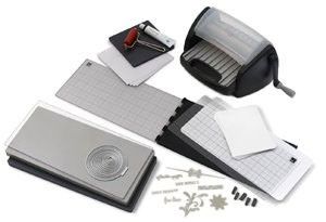
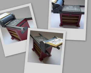
lmachine.jpgThe popularity of scrapbooking has opened up a world of tools and papers that were hard-to-find and expensive just a few years ago. Now there are low-cost manual machines to apply glue (I have one myself — a laminator — that I use for my bookmaking). Similar rotary machines will die cut (mostly pre-made dies, but you can have your own made or there are models that are computer controlled). And now, coming to a craft store near you this fall, is L, “the Letterpress combo kit [that] contains everything you need to begin letterpress printing right away.” In the pictures below, you can see how it works…
But what exactly is “letterpress”? Is it only, as their website explains, “printing words or designs with ink while simultaneously debossing it into a thick, soft paper.” I suppose it is, although I stress in my Etsy listings that my printing work is all done on my vintage 1890s large cranky press. The Lifestyle Craft website doesn’t show an example of the impression you can get from their little machine, or what sort of designs and typefaces they will offer, or how to make and use your own. I’m also sure that registering two colors will be fraught with problems. I’m interested to see a demo in person!

Lifestyle Craft’s Letterpress

Ligatures

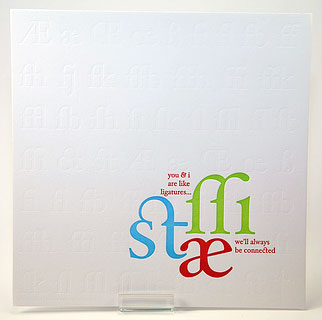
A Favorite DesignOne of the things I enjoy about teaching beginning letterpress is watching students discover the ligatures in the type case, especially the students with no graphic design background. (A ligature is a character or type combining two or more letters that would look too spaced out if printed separately, such as fl or fi.)
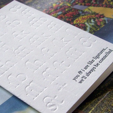
One of the prints I got as part of a printer’s swap earlier this year is A. Favorite’s ode to ligatures, on the left. It’s hard to see all the ligatures she’s blind stamped in the background but she has a card, below, that shows off the blind stamping and highlights those beautiful ligatures.
You can see more about what I like about teaching here.


A Favorite Design

Paper-folding: Printing Machine

Printing PopupOn the day that John Sullivan (the president of PCBA) mentioned to me that this year is the 100 anniversary of the Vandercook proofing press and that he’s getting together an article celebrating the anniversary for an upcoming Ampersand, I saw a link to this nifty paper-folded printing press. It sort of looks like a Vandercook (it’s actually a “Korrex Newspaper Printing Machine”) And best of all the bed of the press has locked-up type and there’s a printed two-up spread on the feedboard. I’ve download it and have it mostly cut out — I’ll put it together after supper tonight.