Write Like They Used To

Today is National Handwriting Day in the US. For years I’ve typed almost all my correspondence and my handwriting has gotten quite illegible. Plus I’ve never really liked my own scrawl very much. So I love to find digital handwriting fonts, especially old-fashioned ones like Old Fonts — “authentic 18th and 19th century penmanship” fonts from Three Islands Press in Maine. The example below is Emily Austin. And be sure to check out the lovely ampersand in the text font Broadsheet.

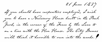
www.oldfonts.com example

Rainbow in Oz

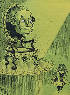
Rainbow in ozI discovered COLOURlovers when I was working out the design and palette for my calendar earlier this summer. They give “people who use color … a place to check out a world of color, compare color palettes, … and read color related articles and interviews.” My friend Kate says she’s been using them lately to open her color thinking and she pointed me to a wonderful article about the colors in the original printing of The Wizard of Oz.
Click on the picture to the left to view beautiful high resolution scans of a first edition of the book, preserved in the Library of Congress Rare Book and Special Collections Division.
Rainbow in ozAnd to the right is one of the palettes you can create on COLOURlovers, this one taken from the colors in that first edition of The Wizard of Oz.

The Cult of Gocco

Sugar LoopOne of the nicest parts of the Book Jam last Saturday was chatting during the slow times with the book artists’ at the table adjacent to mine, Kate Godfrey and Nikki Thompson. Nikki produces books using hand-set type on a letterpress as well as with her Japanese-made Gocco printer (a small screen printing system). Throughout the day, I over-heard Nikki describing her Gocco and how it works to visitors and then end with “but the machines aren’t imported any more and it’s hard to get supplies”.
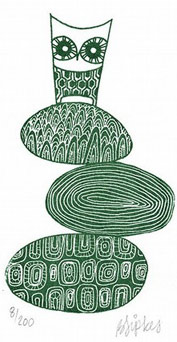
My knowledge about Gocco printing is pretty limited — it’s popular on Etsy to make cards, prints, housewares and t-shirts. And in one of the first issues of Ampersand that I edited, Nicholas Yeager explains how to use a Gocco printer to etch images in metal. (The owl to the right is a Gocco produced print by Bernadette Sipkes that’s hanging in my house.)
So imagine my surprise on Sunday when I opened the New York Times Sunday Magazine (of all things!) to find an article entitled The Cult of Gocco: How the end of a product turned into a publicity event — and maybe, a new beginning. It seems that an artist named Jill Bliss started the website SaveGocco.com to do just that — create enough publicity that would inspire the Japanese Gocco manufacturer Riso to make and import the machines again with a letter writing campaign.
From poking around on the web a bit, it looks like they’ve had some success, as more and more stores carry both the machines and supplies. Here in San Francisco, Arch is now importing and selling machines & supplies. Online Paper Source and Wet Paint Art sell machines. The Japanese-based Etsy sellers Print Addict Japan, Felt Cafe and good-ness will ship supplies and machines to the US. Nikki says she buys her supplies from Welch Products. And there are yet more dealers here.

Teach Yourself Letterpress Printing

Printing for PleasureWhen I have a question about my press or how it’s not printing as I would like, I look on Briar Press’s bulletin board or through the PP Letterpress archive. But sometimes I’d really rather look through a book, especially at my studio where there isn’t an internet connection.
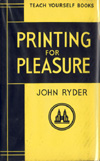
Too bad there aren’t many modern letterpress books, and even the old ones don’t have much information on fixing smaller tabletop presses, like C&P Pilots, and nothing on using photopolymer plates. Boxcar has digitized a Kelsey manual with information on oiling, press set up, makeready and printing on envelopes. A friend gave me Letterpress: New applications for traditional skills by David Jury — the title sounded promising but it’s just a coffee table book with lots of pictures and nothing really practical about printing. Paul Moxon has written an appreciation of John Ryder’s 1955 book Printing for Pleasure (available from NA Graphics).
Here’s what’s on the shelf at my studio:

  • Platen Press Operation by George J. Mills (from 1953, reprints are available from NA Graphics). General Printing: An Illustrated Guide to Letterpress Printing (also from 1953, and recently reissued and available from Amazon). The latter has a nice section on the history of printing, and both have good information on setting type, lockup and makeready.
  • The only book I’ve found with information on photopolymer plates and letterpress is Gerald Lange’s Printing Digital Type on the Hand-Operated Flatbed Cylinder Press. It doesn’t discuss platen press printing per se, but the sections on troubleshooting and the platemaking process apply to any press.
  • A new acquisition is Barbara Tetenbaum’s A Guide to Experimental Letterpress Techniques. She discusses how to do pressure printing (putting string or a stencil behind the printing sheet) and other techniques using found objects. She’s bound examples of each technique into the spine. Her instructions are for cylinder presses, but I’m thinking I can modify many of them for my platen press (a project for next year!) (Available from Another Room Book Arts Bookstore.)
  • My favorite book by far is Clifford Burke’s Printing Poetry: A workbook in typographic reification. It’s long out of print (but you can get used ones from Amazon) and my copy was a special Christmas present from my Mom when I got my first press. It’s mostly concerned with typography and poetry, quirky and opinionated, and has a section called “of Money, Time and Rust,” the bugbears of those of us with the letterpress printing bug.

Printy Quotes

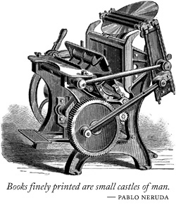
Books finely printedI keep a notebook of quotes and poetry that I scour for titles for my broadsides. Juliet, over on the muddy island, sent me a link to a lovely site with quotes about printing: the cavendish gallery of print and typography. It pairs the quotes with printing-related images.
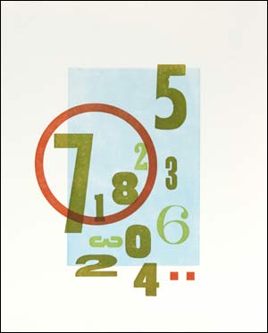
The gallery doesn’t include one of my favorite quotes, so on the right is my own addition, paired with my favorite printer.
And below is the text from the gallery entry with a phrase that inspired the title for one of my recent wood type collage broadsides, Safe Ground.

This is a printing office.
Cross-roads of Civilization,
Refuge of all the Arts against the Ravages of Time.
From this place Words may fly abroad
Not to perish as Waves of Sound
But fix’d in Time,
Not corrupted by the hurrying Hand
But verified in Proof.
Friend, you stand on Safe Ground:
This is a printing office.

Outside the Box

Secret Sky
This is my latest broadside, Secret Sky. I wanted a large swash of color in the background, so I used an uncut linoleum block to print the light blue. It required a lot of makeready (shimming up the block in the back, as well as some under the tympan of my press. The block isn’t flat nor is it an even thickness. Next time I want a solid fill I’ll try another material!). The circle is a photopolymer plate and the rest is wood type.
Here’s the quote that inspired the title:

“This is love: to fly toward a secret sky, to cause a hundred veils to fall each moment. First to let go of life. Finally, to take a step without feet.”
–Rumi