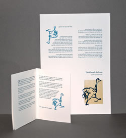
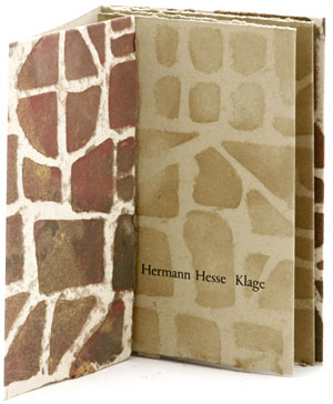
 At the Codex Book Fair last week, I stopped by book binder John DeMerritt’s table to say hi and admire his wife Nora’s new book. We started talking about paper, and John said to be sure to look at the pulp painted papers made by John Gerard at the table across from him. I was immediately entranced by the beautiful papers and bought the chapbook on the left. It’s very simply made — an accordion text block with a letterpress printed poem is pamphlet sewn into the covers, but it shows off the paper so well!
 To make a pulp painting, specially prepared pulps are applied to a freshly made sheet of handmade paper, sometimes with the aid of stencils, sometimes freehand, so that when it all dries, the finished sheet of paper fully incorporates the image. Several years ago, we had an article in the Ampersand about Claire Van Vliet’s large pulp painted broadsides — you can see two of them online: What evaluation we make of a particular stretch of land… and this glorious one called A Scribe of Kloster Eibingen with pulp painting, letterpress and silkscreen.
I seem to be in a poetry reading mood recently — the Hesse poem in my new acquisition is in German, but I found a translation online by Joseph Knecht:
Lament
by Hermann Hesse
No permanence is ours; we are a wave
That flows to fit whatever form it finds:
Through day or night, cathedral or the cave
We pass forever, craving form that binds.
Mold after mold we fill and never rest,
We find no home where joy or grief runs deep.
We move, we are the everlasting guest.
No field nor plow is ours; we do not reap.
What God would make of us remains unknown:
He plays; we are the clay to his desire.
Plastic and mute, we neither laugh nor groan;
He kneads, but never gives us to the fire.
To stiffen to stone, to persevere!
We long forever for the right to stay.
But all that ever stays with us is fear,
And we shall never rest upon our way.
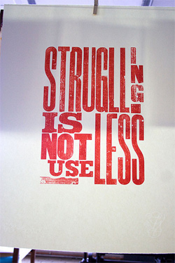
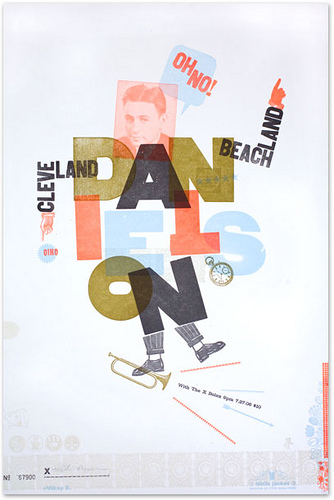 My post earlier this week on an article about letterpress in Forbes and Kate’s comments got me to thinking about my own taste in letterpress posters. The main inspiration for my own wood type collage prints was a lecture I attended where Alastaire Johnston talked about the work of H N Werkman (I have a post about his calendars here). Werkman’s broadsides seem so spontaneous — he printed with anything he could find in his studio, including furniture. But it is definitively sloppy and probably over-inked printing.