In my bookmaking, I keep coming back to this poem by Emily Dickinson
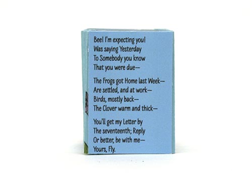
Bee! I’m expecting you!
Was saying Yesterday
To Somebody you know
That you were due—
The Frogs got Home last Week—
Are settled, and at work—
Birds, mostly back—
The Clover warm and thick—
You’ll get my Letter by
The seventeenth; Reply
Or better, be with me—
Yours, Fly.
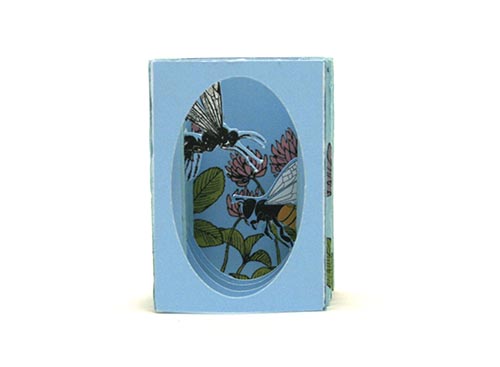
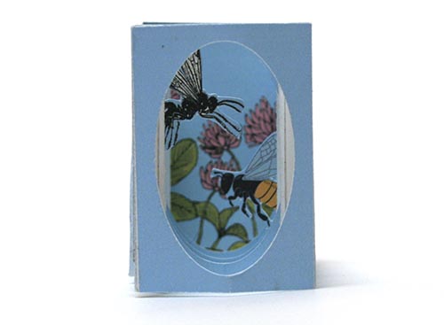
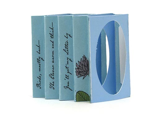
Last year I started to make a tunnel book based on the poem, but didn’t get very far. Recently I revisited the book. Here’s the first version. It’s constructed by placing 5 panels between 2 accordion-folded strips (instructions here). The strips make up the sides of the book. It’s a matchbox book, so it’s small—1-3/8″ wide by 2″ tall.
I put the poem on the sides, in the accordion folds.
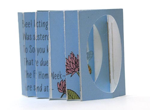
Two problems with this version. First, the poem is hard to read. Second, I printed the side accordion on white paper, which cracked when I folded it, showing the white core. So I tried using blue paper.
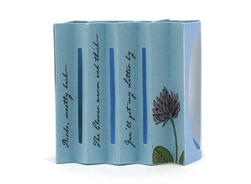
The blue is a lot darker, almost a gray blue, so the printing colors are dull (it’s printed on my Epson inkjet). There’s not as much light inside the tunnel because the paper is blue on both sides. For the poem, I tried turning it 90 degrees and made the type darker…
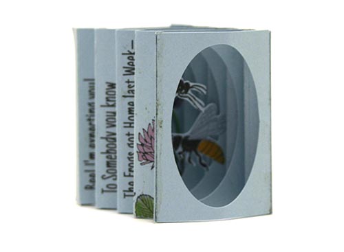
But now only every other line of the poem is visible, with the odd lines hidden in the accordion fold, so that didn’t work! Next I looked for a brighter blue paper. I found one, and used it for the accordion sides. I printed the panels inside the tunnel on white paper, hoping the blues wouldn’t be too different. This would keep some white on the paper facing the inside of the tunnel, to provide more light. I also added slits in the accordion sides. I put just half the poem on the sides—on the folds facing the viewer.
Here’s another shot of this test. The poem placement is better, if I used a different font it might really be readable (that’s an 19th century handwriting font in this test)
But where to put the rest of the poem? Only half of it fits on the 2 sides. I tried putting it on the top of the matchbox sleeve. Then I showed the book to several people who all said the poem actually wasn’t readable on the sides. So I tried the back of the book
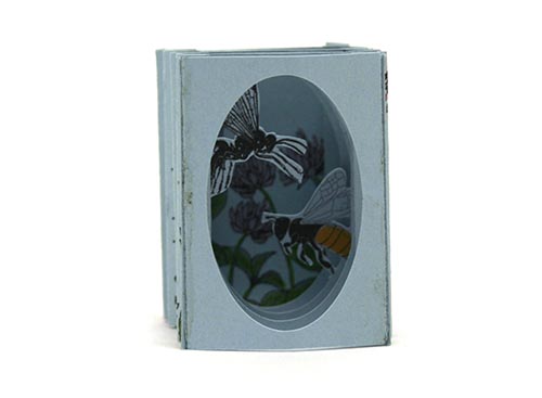
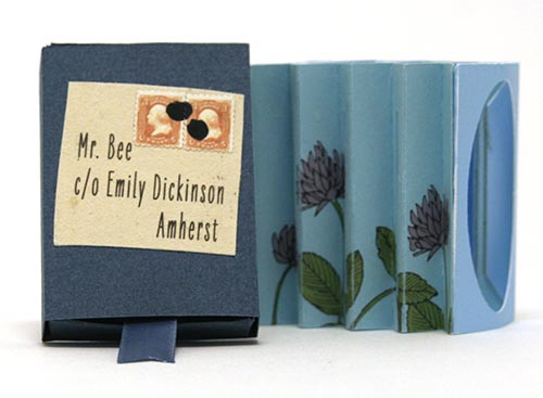
That allowed me to put an envelope on the matchbox sleeve, since the poem is a letter. And I changed the sides to have clover. (I tried putting the the poem in the envelope, but it’s awfully tiny and hard to get the sheet out of the envelope.)
Here’s the current state of the tunnel—the fly and bee need work (with prototypes, sloppy cutting is allowed!). And how will the viewer know the poem is on the back of the book? That’s when I realized that the poem can go in the bottom of the matchbox, so the viewer sees it when she removes the tunnel book. So that’s what I’m going to try next.