  |
In 2005 I started a new flipbook about a girl who is both a ballerina and a hip-hop dancer. My idea was that she would start off as a ballerina doing an adagio, and when she does a pirouette she turns into a hip-hop dancer who shows off her moves before turning back into a ballerina again. I drew rough pictures and made them into a movie but didn’t like the result. A flip book has to work both forward and backward, and I couldn’t make the story work in both directions. (My experience is that about 50% of the people who look at my flipbooks start from the back and the other half start from the front.)
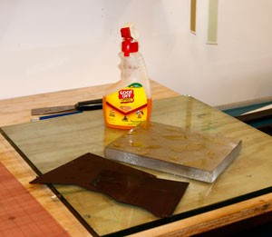
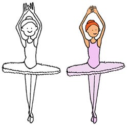
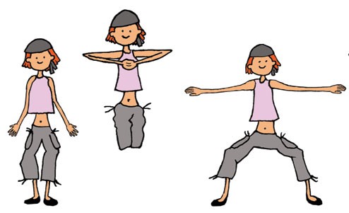
![]() A month or so ago I happened upon the folder with all the drawings, and I took another look at what I’d done. Since 2005, I’ve made an enormous number of the flipbooks I sell in my shop and I’ve honed the production down to an exact science. I realized just by looking at my sketches that if I applied all that experience to the story I’d started, I could make it work. Of course there are a lot of steps, at least for me, before I’m ready for producing the books. First I had to flesh out my story and draw more frames. These need to be scanned and cleaned up in Photoshop. I draw the pictures in black and white and color them after scanning, using Photoshop again. I get a more even color across the frames if I do the coloring digitally. The second picture above is an example of my first sketch and the final cleaned up and colored version. The hands and head were too big on most of my sketches.
A month or so ago I happened upon the folder with all the drawings, and I took another look at what I’d done. Since 2005, I’ve made an enormous number of the flipbooks I sell in my shop and I’ve honed the production down to an exact science. I realized just by looking at my sketches that if I applied all that experience to the story I’d started, I could make it work. Of course there are a lot of steps, at least for me, before I’m ready for producing the books. First I had to flesh out my story and draw more frames. These need to be scanned and cleaned up in Photoshop. I draw the pictures in black and white and color them after scanning, using Photoshop again. I get a more even color across the frames if I do the coloring digitally. The second picture above is an example of my first sketch and the final cleaned up and colored version. The hands and head were too big on most of my sketches.
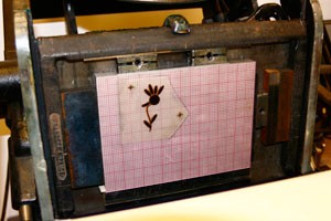
![]() I put all the frames in order in layers in Photoshop, all the same size, so I can turn layers off and on to see how things are lining up. I also print out the frames on one sheet of paper, like a condensed film strip, again so I can make sure everything is sized correctly, that the details in the illustrations show up, and the colors are okay. Here’s an example of that:
I put all the frames in order in layers in Photoshop, all the same size, so I can turn layers off and on to see how things are lining up. I also print out the frames on one sheet of paper, like a condensed film strip, again so I can make sure everything is sized correctly, that the details in the illustrations show up, and the colors are okay. Here’s an example of that:
![]() A flipbook is sort of a movie, but depending on how fast the reader thumbs through the book, it can be slow or fast or smooth or jerky. But to get an idea of how the book would flip in an ideal world, I also make a movie using IMovie. Here’s the book playing forward:
A flipbook is sort of a movie, but depending on how fast the reader thumbs through the book, it can be slow or fast or smooth or jerky. But to get an idea of how the book would flip in an ideal world, I also make a movie using IMovie. Here’s the book playing forward:
[youtube KL2M3XKaQaE]
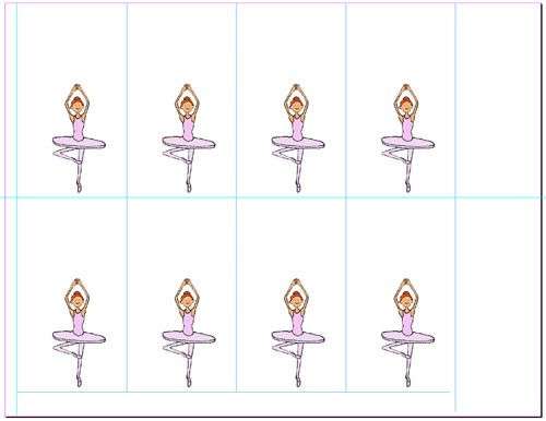
![]() Finally, I’m ready to assemble everything for printing and binding. For that I use InDesign. To make cutting the books easy, I put a grid on the page, then put the same frame in each slot on the page, then repeat for all the frames in the book. Now when I print the pages, the book is collated, and all I need to do is chop it, staple it, and glue on the binding strip at the top. There’s no chopping necessary after the binding, to even up the edges. The page below shows the grid — the blue lines are the cut lines after everything is printed. The paper is letter-size (8-1/2″x11″), grain long (the staple/binding goes on the long edge so the pages flip well). I use fairly heavy text-weight paper (32 lb) — cover stock is too thick to flip well, and thinner paper tends to stick together.
Finally, I’m ready to assemble everything for printing and binding. For that I use InDesign. To make cutting the books easy, I put a grid on the page, then put the same frame in each slot on the page, then repeat for all the frames in the book. Now when I print the pages, the book is collated, and all I need to do is chop it, staple it, and glue on the binding strip at the top. There’s no chopping necessary after the binding, to even up the edges. The page below shows the grid — the blue lines are the cut lines after everything is printed. The paper is letter-size (8-1/2″x11″), grain long (the staple/binding goes on the long edge so the pages flip well). I use fairly heavy text-weight paper (32 lb) — cover stock is too thick to flip well, and thinner paper tends to stick together.
That’s about it. All my flipbooks are are available here. I have other posts on my blog about flipbooks here.