I have a box full of paint chip sample cards from remodelling our house. What to do with them? I looked around on the web and found 2 interesting projects:
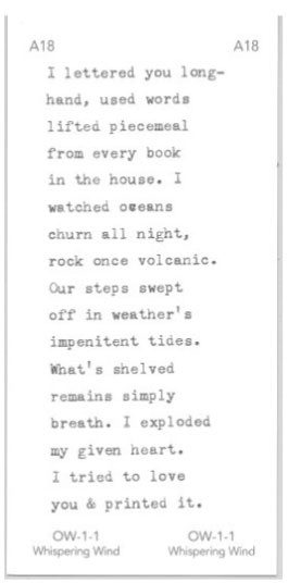
- Suzanne Heyd composed poems on the chips with a typewriter (that’s one to the right, more here). Phylum Press published a chapbook of her work called Crawl Space.
- Rachel Bergert‘s project 100 Colors, 100 Writings, 100 Days: Every day for one hundred days she picked a paint chip out of a bag and responded to it with a short writing. Here’s what she wrote in response to “bee pollen,” a pale yellow:
At some point in childhood, we start having memories, born of experience and not of photographs or family lore. Before I had memories, our attic had a wasp nest. It was discovered and fumigated but not removed. My first memories are of buzzing, of lying awake at night in terror, of the wasps that had surely returned.
See more entries here.
Beyond Perfect-Bound
 The Poetry Foundation recently posted an interview on their website with book artist Jen Bervin and poet Nancy Kuhl about small publishers producing poetry chapbooks — both the traditional form of pages sewn along a fold as well as more complicated artist’s books. It’s interesting for what they have to say about the state of the chapbook, although I spent more time exploring the links within the article to various bookworks.
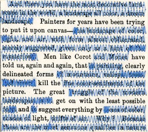
![]() The page detail to the left is from Jen Bervin’s The Desert — “a poem (she) wrote by sewing row by row, line by line, across 130 pages of John Van Dyke’s, The Desert: Further Studies in Natural Appearances (1901).” Bervin uses sewing in many of her books — her website has good pictures and text about her editions. She talks in the interview and on her website about the small chapbooks Emily Dickinson made of her poems, as well as Dickinson’s use of punctuation and marks to indicate variants in her work. The Dickinson Fascicle is Bervin’s artist book in response to Dickinson’s work. Bervin also has an online-only artist book, A Non-Breaking Space.
The page detail to the left is from Jen Bervin’s The Desert — “a poem (she) wrote by sewing row by row, line by line, across 130 pages of John Van Dyke’s, The Desert: Further Studies in Natural Appearances (1901).” Bervin uses sewing in many of her books — her website has good pictures and text about her editions. She talks in the interview and on her website about the small chapbooks Emily Dickinson made of her poems, as well as Dickinson’s use of punctuation and marks to indicate variants in her work. The Dickinson Fascicle is Bervin’s artist book in response to Dickinson’s work. Bervin also has an online-only artist book, A Non-Breaking Space.
Despalles éditions
In conjunction with the CODEX book fair next February, the KALA Institute in Berkeley is offering several book arts-related workshops. I took a peek at the list, and was intrigued by one title: “When poetry meets contemporary art, or: how the text is getting a shape.” The description says it’s a lecture-workshop that will discuss, among other things, “the liberation of typography as a visual art; the variable aspects of the double-page as the basis of the book when its form is the codex” using books produced at the publisher Despalles éditions
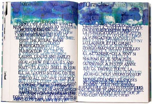
![]() Of course I went to their website to see what sort of books they’re making. I immediately found Cozette de Charmoy’s Oracle, below. The explanation text is in French, and unfortunately beyond the smattering I’ve retained from high school. And while Google translate is somewhat helpful, just looking at the pictures is a treat. Go here to see their work, there are several pictures for each book.
Of course I went to their website to see what sort of books they’re making. I immediately found Cozette de Charmoy’s Oracle, below. The explanation text is in French, and unfortunately beyond the smattering I’ve retained from high school. And while Google translate is somewhat helpful, just looking at the pictures is a treat. Go here to see their work, there are several pictures for each book.
Floating Ink
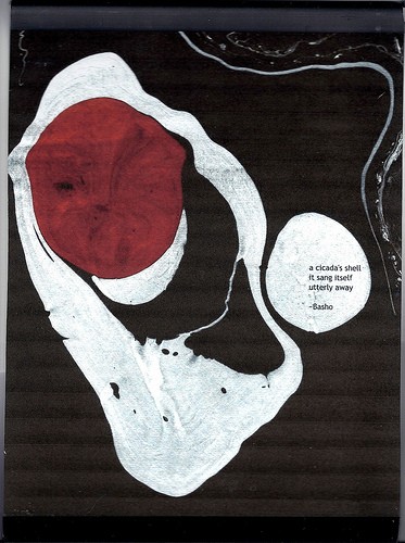 After I wrote about my calendar experiments, Nancy wrote me a comment about her suminigashi broadsides — that’s one to the left, with a Basho haiku. You can see more of Nancy’s marbling and broadsides here on Flickr or read her blog (where she talks about lots more than marbling!) here.
Comment Box Poets
After discovering the Bygone Bureau the other day, I’ve been going through their archives and found this post that says “There’s poetry in everything, including the user comments of NYTimes.com’s most popular blogs. Darryl Campbell investigates the web’s unlikely poetry community.” Especially on the Ben Schott’s Vocabular Blog, where this comment by Tim Torkildson appears on a post called “Typomaniacs: Those with strongly-held views on typography.”
In this modern day and age
Sans-serif is all the rage.
Typeface, point, and spacing too
Are as bland as canned beef stew.
Cursive is no longer seen.
Gothic is a mere pipe dream.
Fonts are nothing but homogenous;
I’d as lief we were androgenous!
(I seem to be finding all sorts of new words this week — lief means gladly or willingly.) See the entire Bygone Bureau post here.
Writing Haiku
Recently I realized that my most creative periods have coincided with my practice of writing haiku (or really senryu) regularly. My first artist’s book was called Haiku, my calendars used my haiku as did my most recent artist’s book Walking. But for the past year, I’ve only written a handful of them. I’ve tried various strategies to get myself writing again, and because I think blog posts should be pretty short, I’ll write about them over the next couple of weeks.
![]() What seems to have worked this week is reading Willa Cather’s Death Comes for the Archbishop. (I’m reading books set in New Mexico, since we just moved there.) Cather’s vivid landscape descriptions are perfect inspiration for haiku.
What seems to have worked this week is reading Willa Cather’s Death Comes for the Archbishop. (I’m reading books set in New Mexico, since we just moved there.) Cather’s vivid landscape descriptions are perfect inspiration for haiku.
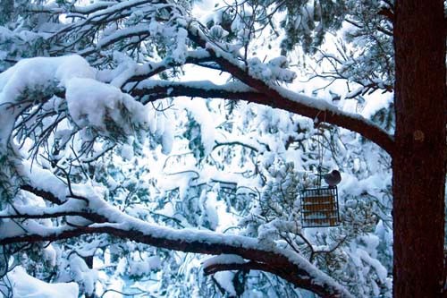
![]() The picture below is from my family room window after a snow storm early last week. And yesterday we had a thunderstorm with lightening and snow. Here’s my reaction:
The picture below is from my family room window after a snow storm early last week. And yesterday we had a thunderstorm with lightening and snow. Here’s my reaction:
The sky grows dark
With a clap of thunder and jolt of lightening—
My computer screen flickers off.
