Update: the function below doesn’t appear to be working anymore and I can’t find a replacement.
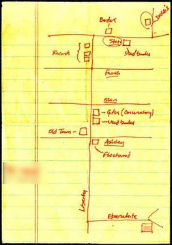
Making a map online is easy, but the results are usually awfully cluttered. Microsoft Research has a map application that takes the results of bing maps and renders it as a “sketchy”, treasure or European or American style map. The first one seems to be drawn on a soiled napkin, the second on old brown paper, complete with a red X. They’ve decluttered the maps, making them look hand-drawn and with only the major roadways indicated.
![]() My results are below — the X marks a restaurant we’re eating at tomorrow in Santa Fe. They are certainly uncluttered, but some of the street names are uncommon (there’s no sign I’ve ever seen that calls Cerrillos Rd the Turquoise Trail, and it’s not really marked as Rt 14 until it gets out of town). Despite that, I’d certainly send one of these maps to someone before the standard online map.
My results are below — the X marks a restaurant we’re eating at tomorrow in Santa Fe. They are certainly uncluttered, but some of the street names are uncommon (there’s no sign I’ve ever seen that calls Cerrillos Rd the Turquoise Trail, and it’s not really marked as Rt 14 until it gets out of town). Despite that, I’d certainly send one of these maps to someone before the standard online map.
![]() To try it yourself, go to bing maps, and download the “bing maps” plugin for your browser (you’ll have to restart your browser after the download). Once you’ve done that, this link should take you to the plug in. Now click on “map apps” at the bottom of the page, and find “Destination Maps.” Once you’ve clicked on that, there are instructions to create a map….
To try it yourself, go to bing maps, and download the “bing maps” plugin for your browser (you’ll have to restart your browser after the download). Once you’ve done that, this link should take you to the plug in. Now click on “map apps” at the bottom of the page, and find “Destination Maps.” Once you’ve clicked on that, there are instructions to create a map….
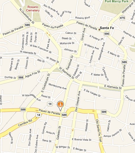
Standard online map
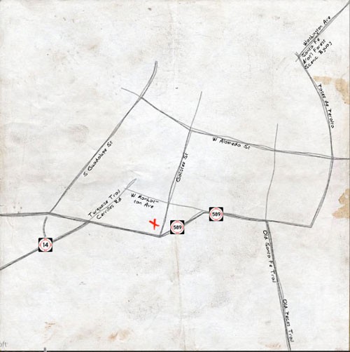
Sketchy (or napkin) map
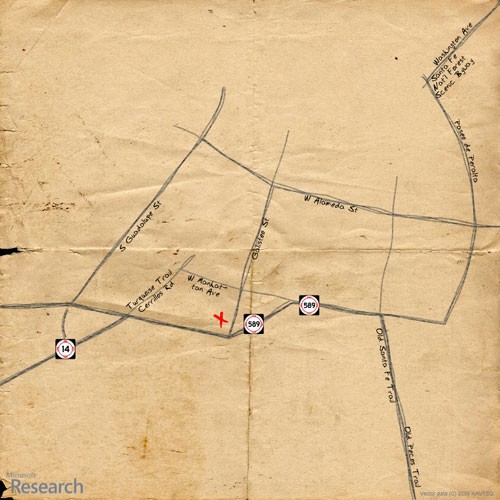
Treasure map
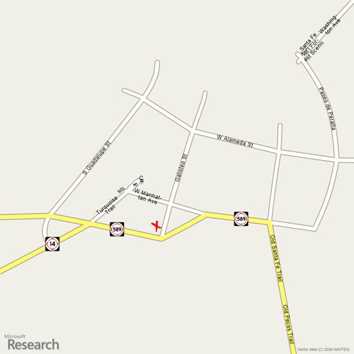
European style map
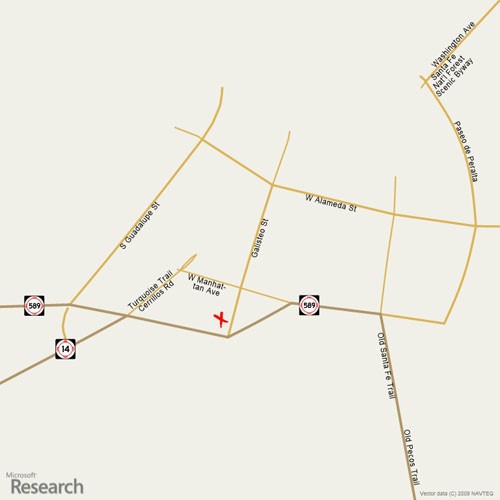
American style map

