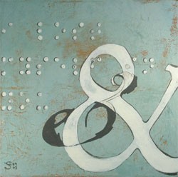
 Not long after I opened my Etsy shop, I discovered the typography paintings of Shannon Tudyk. After a long hiatus, I recently looked again at her website, and she now has a series called landmarks that includes maps and type and signage.
 Not long after I opened my Etsy shop, I discovered the typography paintings of Shannon Tudyk. After a long hiatus, I recently looked again at her website, and she now has a series called landmarks that includes maps and type and signage.
The Fantastic Flying Books of Mr. Morris Lessmore from Moonbot Studios. “Morris Lessmore” is a story of people who devote their lives to books and books who return the favor. It is one of five animated short films considered for outstanding film achievement of 2011 in the 84th Academy Awards.
![]() To see a full screen version, click on the symbol to the left of the word “vimeo”…
To see a full screen version, click on the symbol to the left of the word “vimeo”…
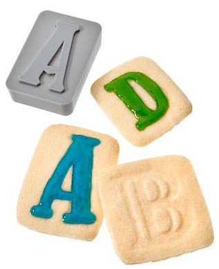
Check out these Letterpress type-style cookie cutters. The set even includes a “!” and “&” but unfortunately no “?”
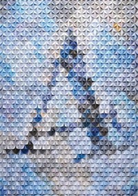 According to Francisca Prieto’s website, she is
fascinated by typography. She deconstructs type to create her own three-dimensional interpretations of the things … Originally trained as a graphic designer Francisca takes a mathematical approach, which can be seen through the grids and systems applied to each piece she creates.
The piece to the left is part of her Between Folds project, where she “explores the deconstruction of rare illustrated periodicals and books using modular structures and typographical elements.” She also has a nice set of alphabet prints.
![]() There’s an interview with Francisca here.
There’s an interview with Francisca here.
Last fall, the blog DesignSponge had a Design Your Own Alphabet Contest and I’m just now getting around to looking at all the entries and the winners.
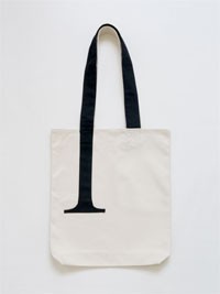 I quite like this serif tote bag…