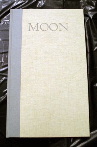
This book neither swaggers nor complains

Moon, selection of poems by David Romtvedt… ; it rests in the hand; it breathes.

This is Robert Bringhurst’s review of Moon, David Romtvedt’s first book-length collection of poetry, letterpress printed with handset type by Gerald Lange. I thought that line was quite beautiful, and hope I can print a book one day that deserves that sort of praise! You can see a few more pictures here. And read one of Romtvedt’s poets here.

Children’s Illustrated Books as Artist’s Books

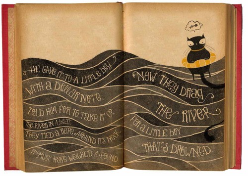
I often think the best artist’s books are children’s picture books. The other day on Brain Pickings there was a post entitled Little Big Books: What Makes Great Children’s Picture Book Illustration about a book that documents some of the best contemporary children’s book illustration. I noticed the spread below from Laura Varsky’s Lady René. (The font for this book is available here and Varsky’s website — with more books and illustrations — is here.)

Page from lady rene by laura varsky

em-dash and spaces

In a comment to my post the other day about my current prompt challenge, Steven said

When setting em dashes the typesetter should not place space on either side of the dash.

When I started editing the PCBA Ampersand and put together a style sheet, I asked several people about em-dashes and spacing, and got several different answers. I decided against spaces. And for the haiku in all my calendars, I’ve not used a space. But Steven’s comment made me notice that wordpress (which I use for this blog) has its own idea about dashes and spaces. It turns a double dash into either an en-dash or em-dash, depending on whether the dashes are at the end of the line or have spaces around them.

  • Double dash — with spaces; wordpress makes an em-dash
  • Double dash–with no space; wordpress makes an en-dash
  • Double dash at the end of a line, with no space, but becomes an en-dash–
  • Double dash at the end of a line, with a space, but becomes an en-dash —
One solution is to always use the HTML character for em-dash (—) instead of counting on wordpress.
A quick look at some style guides here on the web gives a variety of answers to the spacing question. Some say it is optional (Yahoo), no spaces (Chicago Manual of Style), spaces (Associated Press Style Book). And the British, in the Guardian style guide, ignore the issue by saying “Dashes should be n-dashes rather than m-dashes or hyphens.”
New Blog: Lettering vs. Calligraphy

I recently ran across a new website: Lettering vs Calligraphy, a collaborative project by Giuseppe Salerno and Martina Flor. Every day they create a letter responding to a keyword given by a moderator, one using lettering (drawing) and the other using calligraphy (writing). Who knew there was a difference?
This being the web, visitors are invited to vote for their daily favorite. Below is J — lettering on the left (by Martina), calligraphy on the right (by Giuseppe).

lettering-vs-calligraphy.jpg