Clothesline Caps

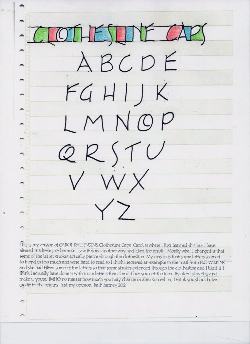
In the “Tiny Writing” class I took last weekend (see more about the class here), one of the alphabets we learned was “Clothesline Caps,” where the letters are connected by a horizontal line on top and bottom and then the spaces in between are colored.

Clothesline Caps collaborative project

It’s quite festive, don’t you think? The picture above is the collaborative project we did in the class—on a 16-fold accordion, each of us wrote our initials and colored them. The horizontal lines connected the panels, so that when the accordion is folded, there a hit of color on the foreedge. Since we did a book for each student, it was really good practice for making the letters. I think by the last one I finally wrote an “S” I actually liked.
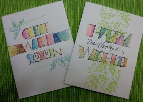
To get a better idea of the letters, below is an example sheet of the alphabet done by Kath Harney. And below that are examples of the font on cards by her friend Randi Kander.

Kath Harney’s clothesline caps worksheet

Randi Kander’s cards using clothesline caps

Art Gothic

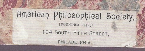
Last month I wrote about using What the Font to identify a typeface. Here’s the image I gave to “What The Font”

The answer was a modern digital font, Dexterous.

Steve Saxe wrote to remind me that the specimen I was trying to identify was from a pamphlet printed from metal type, not a digital publication. While such a font search might point me in a general direction, I should have looked further and found the foundry type face name. Here’s what Steve wrote, including a bit of history of the face that was used in the specimen, Art Gothic:

Type designs cannot be copyrighted (though they once were, in the US at least.) But names can be copyrighted, so those who wish to copy or pirate a design usually think up a new name for it. (For instance, “Swiss” for “Helvetica.”) Dan X. Solo did this with a lot of ornamented typefaces. This causes great confusion, since some popular faces have been arbitrarily given several names. In this case, forget “Dexterous.” For that matter, forget “Identifont” when you are dealing with metal typefaces – it may work for digital faces, but the sample given was clearly printed before the twentieth century.

Art Gothic was designed by Gustave Schroeder of the Central Type Foundry, St. Louis. It was patented 17 May 1887 in the name of Carl Schraubstadter, owner of the Central Type Foundry (US design patent D17350)

From Nineteeth-Century Designers and Engravers of Type by William E. Loy, edited by Alastair M. Johnston and Stephen O. Saxe:
“It may be said he [Schroeder] originated a new departure in letter designing, and his first series, the well-known Art Gothic, was the most severely criticized and the most highly praised of any style in recent years. It soon made its way in popular favor, and has been bought and worn out three or four times in some offices. The suggestion for this series was discovered by Mr. St. John on the label of a soap box.”

David MacMillan also wrote me about the post, and pointed me to his website, a list of metal types, most with specimen sheets and the history of the face, here. In particular, there’s a scan of a specimen sheet for Art Gothic here.

What The Font Game

A bit of fun for a chilly afternoon: The other day on the book arts list someone asked about identifying the title font in this image

Rather quickly, someone responded “WhatTheFont identifies this font as “Dexterous” which is a new design based on an “antique typeface” (unnamed). The lowercase r is somewhat different, but the other letters are very similar.”

So I found What the Font to check it out. I had to edit the image to capture just the title, change the contrast/brightness in order to make the letters darker, and rotate the line a bit to make it straight, like so:

Here’s the results

dexterous.jpg

Along the side of the results were a list of “related tags” that seemed useful: Art Nouveau, sans-serif, French, soft, rounded, gothic, clean, American, retro, ornamental. And at the bottom, it said ” No good match? Submit your image to the WhatTheFont Forum to have your image viewed by font geeks the world over. Or try Identifont to identify your font by answering a series of questions about the letter shapes.
For more fun, I tried Identifont as well, but didn’t get very far because the questions assume you have the entire font (the first one asks about upper-case Q, second about $, third about upper-case M… none of which I have).
Here are links to Dexterous and Art Gothic URW, the first 2 fonts on the list above.

luv 4evR

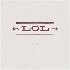
Matthew Chase-DanielLast month, Edie Tsong spoke at the monthly Santa Fe Book Arts Group meeting. She’s very interested in poetry, and she had a contest asking people to submit a love-letter written using text abbreviations. She then letterpress printed the result as a broadside. For those of us who don’t read the abbreviations well, here’s what it says:

Early this morning
before the sun
I rolled out of our bed to soak
olive slowly shifting to black
raven and owl chasing
each other in the meadow
white bird of night
black bird of day
endless conversation
swooping play
and dance
love M.

Read more about the poem and contest here.

Paper Innovation that Changed Type Design

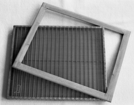
20121205_type-wove-mould.png

James Felici has posted an article about “how a change in papermaking technology caused a revolution in type design (and upsetting some delicate sensibilities in the process).” He starts out

John Baskerville is known best as the man who, in the mid-18th century, created a new typeface that now bears his name. It was finer, more delicate, and lighter on the page than all that went before it, and it opened the door to a new genre of type designs: the so-called modern faces, including Bodoni and Didot. As such, Baskerville and faces like it are commonly referred to as transitionals, the bridges between oldstyle and modern.

But Baskerville’s innovative types—and those that followed—could only have existed because of his arguably more important innovation: a new papermaking technique that yielded sheets whose smoother surface could reproduce much finer detail in both type and graphics, including etchings and engravings.

Read the rest here. And see all of his articles on Creative Pros.