Catherine Lorenzo Realce’s typography coaster
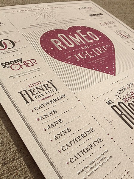
Jim Godfrey’s letterpress poster celebrates harmonious font combinations using famous couples for the examples.
I took over editing the PCBA Ampersand in the fall of 2004. The first issue was a book arts resource guide, and was put together by me and my friend Cathy. We had a lot of fun with the layout. In particular, with the back cover, where we did a shaped ampersand filled with “An esoteric list of still more books to consider—for their beauty, for instruction, for inspiration, for fun.” That’s the result below, and I’ve put this list in a more readable form here.
![]() I stumbled across this the other day, when I was dusting the shelf holding my copies of Ampersand. I’d completely forgotten how I did this in InDesign. It’s 10 years later, and my InDesign/Illustrator/Photoshop skills are markedly better. After a while I found myself fooling around with a shaped poster that was all about ampersands. The result is the second photo below. You can see more pictures, as well as one with black instead of white text here.
I stumbled across this the other day, when I was dusting the shelf holding my copies of Ampersand. I’d completely forgotten how I did this in InDesign. It’s 10 years later, and my InDesign/Illustrator/Photoshop skills are markedly better. After a while I found myself fooling around with a shaped poster that was all about ampersands. The result is the second photo below. You can see more pictures, as well as one with black instead of white text here.
I liked the display format of the calendar in a matchbox I did when mocking up 2015 design. I have a bunch of typographic posters I’ve done, so I’ve packaged them up the same way, as a little inspiration in a matchbox. Here are some pictures, and you can see larger ones here.
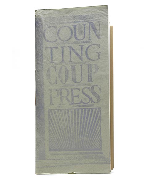
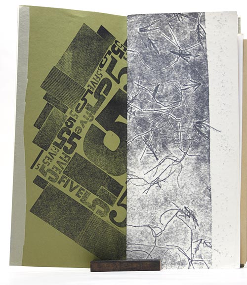
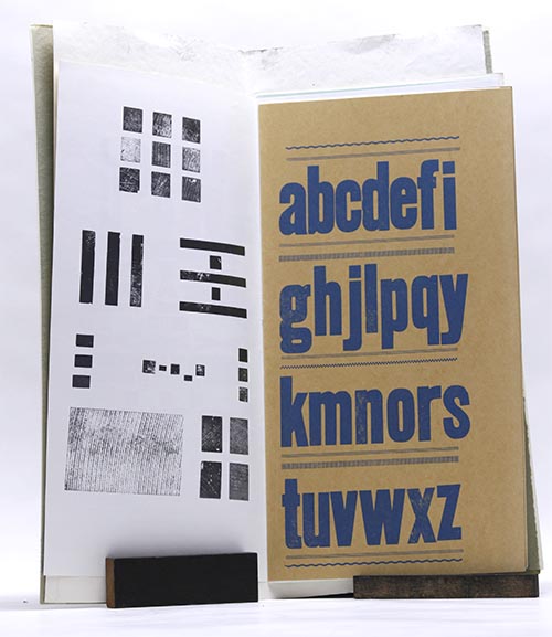
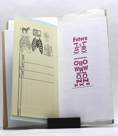
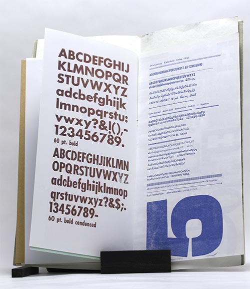
My friend Suzanne lent me the type specimen book she made when she got her Vandercook. Like most of her books, it’s large—when closed, it’s 7″x15″. I’m planning on borrowing one of her sans serif fonts for a book I’m planning to print this summer.
Carol Pallesen wrote some very nice ampersands for us during her workshop last week-end. Then I found this nice poster of ampersands available through Adobe’s typekit. Click on the image below to get a wider, bigger image.