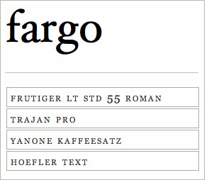
 Which font is this one here? Try your luck with this multiple choice Font Game. [The answer to the left is “Hoefler Text.”]
 Which font is this one here? Try your luck with this multiple choice Font Game. [The answer to the left is “Hoefler Text.”]
 I have a friend who I can count on to know the meaning of any word thrown at her. But to my surprise, I recently stumped her with “interobang.” An interobang is a little used punctuation mark combining a question mark (also called the interrogative point) and an exclamation mark (which typesetters refer to as a bang). That’s it to the right. It was introduced in 1962 by Martin K. Speckter as a short hand punctuation for statements where neither mark alone exactly served the writer (as in “She said what?!”) As a silly extension, the reverse and upside down interrobang (combining ¿ and ¡), suitable for starting phrases in Spanish, is called a gnaborretni (interrobang backwards).
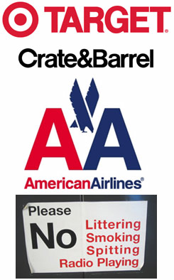 Last week I saw the documentary Helvetica at a special screening at Arion Press in the Presidio in San Franciso. Helvetica is a typeface introduced in 1957 as an antidote to old-fashioned type styles, and it quickly became ubiquitious. Even after 50 years it continues to be used for countless logos and signs (like the examples to the right) and even IRS tax forms.
![]() Overlong but lively, the movie presents the typeface as an emblem of modernity, simplicity and abstraction. The designer talking heads in the film were divided about its popularity and use — from love (“most neutral typeface”) to hate (it’s representative of the Vietnam & Iraqi wars). I find the face too bland and prefer using Gill Sans (there were other votes in the audience for Univers). But the upshot of the movie for me is that I’ve spent the last few days scanning signs to see if they use Helvetica!
Overlong but lively, the movie presents the typeface as an emblem of modernity, simplicity and abstraction. The designer talking heads in the film were divided about its popularity and use — from love (“most neutral typeface”) to hate (it’s representative of the Vietnam & Iraqi wars). I find the face too bland and prefer using Gill Sans (there were other votes in the audience for Univers). But the upshot of the movie for me is that I’ve spent the last few days scanning signs to see if they use Helvetica!
![]() (There were many quotable quotes by the designers in the film. But the one I liked best came before the screening, when Andrew Hoyem, the owner of Arion, read an op ed piece he’d written for the Los Angeles Times on the 50 anniversary of Helvetica — “You might think of sans-serif typefaces as skeletons of letterforms, without flesh or clothing.”)
(There were many quotable quotes by the designers in the film. But the one I liked best came before the screening, when Andrew Hoyem, the owner of Arion, read an op ed piece he’d written for the Los Angeles Times on the 50 anniversary of Helvetica — “You might think of sans-serif typefaces as skeletons of letterforms, without flesh or clothing.”)
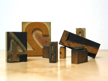 |
In addition to a box of random metal type, I also got a box of random wood type as part of my Christmas presents. I’m not sure yet what I’ll do with them… there’s an entire alphabet plus all the numbers from 0-9, but they mostly don’t match.
There’s a eyeful resource for wood type — the Hamilton Wood Type Printing Museum with lots of history and pictures. |
| Last summer I moved my press from the cramped corner of our garage to a newly rented studio. Finally I have room for more equipment — and metal type. While figuring out what faces to buy, I bought a box of random metal type from Ebay. It arrived today and while I have no idea what I’ll do with it (I think it’s meant to hang on the wall), it’s really beautiful. | 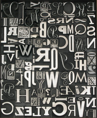 |