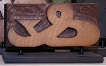
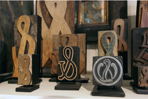
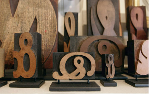
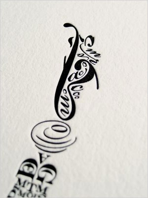
 Last year, when I learned how to use a laser cutter to make my pop-up book Fall, I wanted to see what else the cutter was good for and settled on cutting out wooden pendants in the shape of symbols or letters. Instead of a-z, I decided on ampersands and interrobangs. I looked at other punctuation and symbols too, including the pilcrow, after reading this post on the typographers Hoefler & Frere-Jones’ blog. (A pilcrow is the editor’s paragraph mark — it’s not really a backwards P, according to Hoefler “in its original form, the mark was an open C crossed by a vertical line or two, a scribal abbreviation for capitulum, the Latin word for ‘chapter.’ “) I cut out a few different pilcrows in several font faces and gave up, either unhappy with the way they looked (too much like a backward P) or the legs were so thin they snapped off…
![]() This morning I ran across one of those wooden pilcrow experiments in a dish I keep on my desk of odd pins and coins, and that led me back to reading Hoefler’s post again. And just as entertaining is his post on ampersands.
This morning I ran across one of those wooden pilcrow experiments in a dish I keep on my desk of odd pins and coins, and that led me back to reading Hoefler’s post again. And just as entertaining is his post on ampersands.

