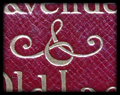
Use the best available ampersand…

… or so says Robert Bringhurst in The Elements of Typographic Style. He also says

Since the ampersand is more often used in display work than in ordinary text, the more creative versions are often the more useful. There is rarely any reason not to borrow the italic ampersand for use with roman text.

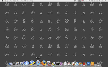
My recent computer woes are boring even to me so suffice it to say that over the past week I’ve been forced into a lot of digital house cleaning. As I hunted around for what I might do to get my various blogs and websites to use less bandwidth, less disk space, less memory and to load faster, I happened on this post about coding web pages to use “the best available” ampersand (that’s where the opening quotes come from). Of course I side-tracked myself completely by reading the entire post, plus comments, and clicking on lots of links (like Robert Rutter’s The Elements of Typographic Style Applied to the Web. ) But I think it would be over-kill (even for me) to have the desktop wallpaper of ampersands mentioned at the end of the post — especially in all black! — see below (or go here for every format imaginable).
Ampersand Desktop

Pangrams

Pangram

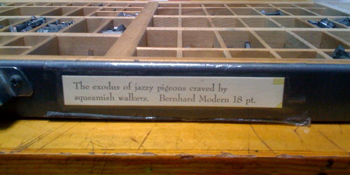
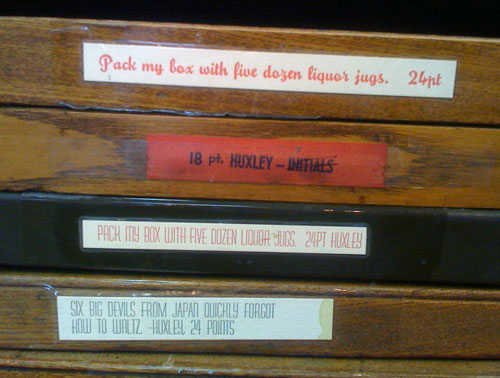
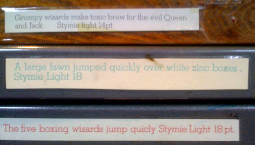
I taught beginning letterpress last Sunday at the San Francisco Center for the Book. I particularly enjoy watching the students select the type face to use for the cards they handset. This time one student chose to pair delicate Arrighi with a wonderful cut of a hen, and another paired a chunky gothic face with a printing block (cut) of a dragon. At the beginning of the day, as I’m setting up, I always check out the type cases to see if there’s anything new, and to read the pangrams. (A pangram is a sentence using every letter of the alphabet at least once. They give the student an idea of what the type in the case looks like — narrow, wide, chunky, small, large, serif or sans serif…) Here are some more examples…

pangram3.jpg

pangram2.jpg

pangram4.jpg

Urban Type Fabric

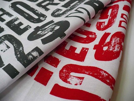
New on Etsy: Greenolive Textiles from Australia handprints fabrics with designs “based on prints from their collection of old wooden type blocks.. (and).. is inspired by a graphic designer’s love of typography and wooden type.” They are sold by the “not-quite-fat quarter.” They have more abstract designs too. Check out their shop here.

Urban Type Fabric

Quillon & Choil

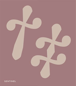
Quillon & ChoilThe traditional reference mark is the asterisk *. The lesser known reference marks are much nicer — the dagger and double dagger. Hoefler and Frere-Jones have a blog post about reference marks, with examples — the ones on the right are from one of their new font, Sentinel.
They’ve written about other punctuation marks — see my blog post about those.
And in case you’re wondering about the title of this post, it refers to the anatomy of the dagger: the quillon is the guard that separates the hilt of a knife from its blade, and the choil is the notch where the blade meets the quillon.

Origin of @

The first known instance of the symbol @ being used in writing: a 1536 letter from an Italian merchant.

If I had to bet, I would say that @, or the at sign, is a recent addition to the symbols we use every day. But this NY Times blog post says I’m wrong. The symbol was first used by an Italian “in a letter written 473 years ago today, on May 4, 1536” (see the picture above). It was used then to indicate an ancient measure of weight or volume. The post is full of fun facts — such as the symbol is called a “snail” by Italians, and “monkey” or “dog” by Slavs.