While poking around and looking for somthing else, I stumbled on this page from Jan Tschichold’s book Treasury of Alphabets and Lettering. I especially enjoyed the advice in the last paragraph…
While poking around and looking for somthing else, I stumbled on this page from Jan Tschichold’s book Treasury of Alphabets and Lettering. I especially enjoyed the advice in the last paragraph…
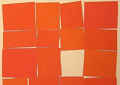 The most intriguing piece at the Friends of Calligraphy show I saw recently was this one by Susan Skarsgard — unfortunately my photo didn’t turn out, this is only a partial image and it’s from Cari Ferraro’s blog (thank you very much Cari!). It’s 26 rectangles, arranged in 7 rows, and the signage says this is part of “26 of 26: An Edition of Twenty-six Alphabets.” My interest piqued, I scoured the web and found 2 more images plus an article about an exhibition that included the 26 prints.
In her gallery statement, Skarsgard says that the exhibit “is a kind of meditation on the alphabet as an object, much the same way that a musician/composer might invent a series of compositions based on a theme.” “The familiar shapes of the alphabet,” she continues, “taken down to their elemental form and stripped of their meaning, have always been intriguing to me. Kind of like arranging the DNA of language and looking at it purely as shape and form.’
|
 One of the things I enjoy about teaching beginning letterpress is watching students discover the ligatures in the type case, especially the students with no graphic design background. (A ligature is a character or type combining two or more letters that would look too spaced out if printed separately, such as fl or fi.)
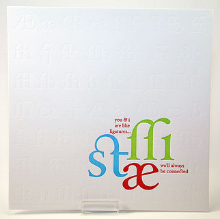
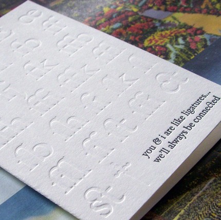
![]() One of the prints I got as part of a printer’s swap earlier this year is A. Favorite’s ode to ligatures, on the left. It’s hard to see all the ligatures she’s blind stamped in the background but she has a card, below, that shows off the blind stamping and highlights those beautiful ligatures.
One of the prints I got as part of a printer’s swap earlier this year is A. Favorite’s ode to ligatures, on the left. It’s hard to see all the ligatures she’s blind stamped in the background but she has a card, below, that shows off the blind stamping and highlights those beautiful ligatures.
![]() You can see more about what I like about teaching here.
You can see more about what I like about teaching here.
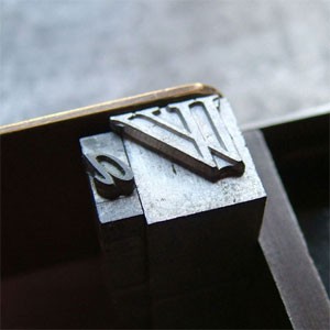 At SFCB where I teach letterpress, some of the italic type are kerned, with the edge of the letter sticking off the type block, so the letters, especially W and T, fit nicely together. Typoretum has a post showing how the kerning is done, and this flickr stream shows kerning type on a Hammond Glider or circular saw. At SFCB where I teach letterpress, some of the italic type are kerned, with the edge of the letter sticking off the type block, so the letters, especially W and T, fit nicely together. Typoretum has a post showing how the kerning is done, and this flickr stream shows kerning type on a Hammond Glider or circular saw.
|
After seeing the calligraphy show at the library the other day, I quite enjoyed this video….
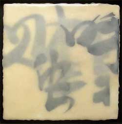 The other day I met my friend Sharon at the San Francisco Main Library to see the Friends of Calligraphy triennial member show. I was prepared to see beautiful lettering, which I did, but there was a lot more. There was Chris Paschke’s encaustic piece, right, which I wanted to reach through the glass and touch. There were also cut paper pieces, a chiseled alphabet, a very delicate, precise paper casting, illustrated books, and illuminated letters. There were quotes and poetry of all kinds, some legible, some not (but still wonderful to look at).
![]() I wrote down the names of a lot of the calligraphers, so I could look up their work at home. I’ll be writing about them in the upcoming days. The title of this post is a quote by Paul Klee, mentioned by one of the exhibitors in her statement about her work and her mark-making. (Klee was a master draftsman, and many of his works are elaborated line drawings; he described his technique in these drawings as “taking a line for a walk.”)
I wrote down the names of a lot of the calligraphers, so I could look up their work at home. I’ll be writing about them in the upcoming days. The title of this post is a quote by Paul Klee, mentioned by one of the exhibitors in her statement about her work and her mark-making. (Klee was a master draftsman, and many of his works are elaborated line drawings; he described his technique in these drawings as “taking a line for a walk.”)
![]() The exhibition continues at the library until Aug. 23 and you can also see photos of some pieces in the exhibition at this flickr stream.
The exhibition continues at the library until Aug. 23 and you can also see photos of some pieces in the exhibition at this flickr stream.