Check out MiChiMa’s store, where she sells felt numbers and alphabets…
 According to Bibliophile Bullpen, this is “called a percontation point — a ‘rhetorical question mark’. . . an irony mark also called a snark or zing. Created by Henry Denham in the 1580s, it pops up in literature every century or so, but never really caught on.” According to Bibliophile Bullpen, this is “called a percontation point — a ‘rhetorical question mark’. . . an irony mark also called a snark or zing. Created by Henry Denham in the 1580s, it pops up in literature every century or so, but never really caught on.” |
 hiannon passed along this quite festive website:
“The Daily Drop Cap is an ongoing project by typographer and illustrator Jessica Hische. Each day (or at least each WORK day), a new hand-crafted decorative initial cap will be posted for your enjoyment and for the beautification of blog posts everywhere”
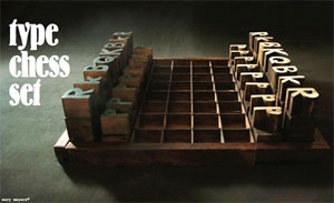
 This chess set made from wood type and a type tray aren’t from someone who loves type or even chess, but from a book by 2 designers called Tossed and Found.
What some view as trash, Linda and John Meyers see as raw material. The wife-and-husband team—subscribers to the “reduce, reuse, recycle” ethos—have perfected a design strategy that will save you money, help the planet, and provide hours of DIY fun. The strategy? First, visit a yard sale, construction-site dumpster, or even your own attic. Select something that somebody (even you) thought had outlived its usefulness. Then, transform that castoff into a piece that’s interesting and usable.
You can see projects from the book here, and read how they made the chess set here.
{via printinteresting}
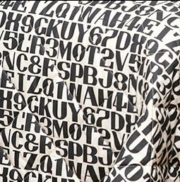
 I suppose an alphabet blanket on my bed would be overkill, even for me, but I do like the “&” in the detail to the left of an Alphabet Quilt made from Alexander Girard’s alphabet. Girard is a “mid-century” designer who specialized in playful patterns and bright colors and was head of Herman Miller’s textile division in the 1950s. House Industries has licensed many of his designs, and you can see them here. There’s a book available too (Alexander Girard Designs for Herman Miller) that has photos of all his textile & furniture work. I suppose an alphabet blanket on my bed would be overkill, even for me, but I do like the “&” in the detail to the left of an Alphabet Quilt made from Alexander Girard’s alphabet. Girard is a “mid-century” designer who specialized in playful patterns and bright colors and was head of Herman Miller’s textile division in the 1950s. House Industries has licensed many of his designs, and you can see them here. There’s a book available too (Alexander Girard Designs for Herman Miller) that has photos of all his textile & furniture work.
|
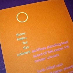
 Greg Smith’s broadside is three haiku written and printed to celebrate Adrian Frutiger’s typeface Univers. You can read the haiku here and see more of Greg’s work on his website. Greg Smith’s broadside is three haiku written and printed to celebrate Adrian Frutiger’s typeface Univers. You can read the haiku here and see more of Greg’s work on his website.
[ Thanks to Karla Shaw for the tip ] |