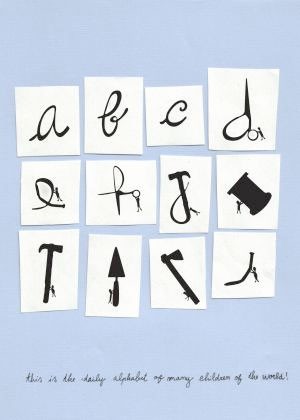
 In December my husband & I had dinner with my friend Hayden, who had recently been to Europe, and his wife Tracey. He told us about the chocolate initials he’d brought back for himself and Tracey, explaining that in the Netherlands, Santa Claus (known there as Sinterklaas) celebrated his birthday by handing out chocolate initials. I thought this was the perfect sort of thing for my blog. But when I went to research it online, I found nothing. Tracey couldn’t find anything either. We debated whether Hayden was just pulling our legs to see what we’d be gullible enough to believe (a thing he tries to do regularly).
 Then today I found this post (on the blog afterimage) that says
Rather than an orange at the toe of their stockings, St. Nicholas (known as Sinterklaas) brings good Dutch children their first initial, in chocolate form. Pastry and even sausage letters are also still available during Sinterklaas season.
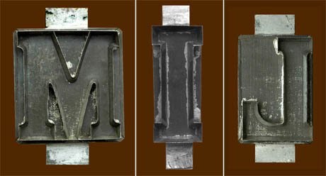
The post points to another blog, called edible georgraphy, and this meandering but interesting post that starts out talking about miniature books and then segues into a discussion of edible letters. The photo above has the caption
Chocolate letter moulds. The letter I is unpopular with manufacturers as all chocolate letters have to weigh the same — those who do produce it often package two Is together. The letter M is the most popular — it is the first initial of moeder (mother) and mama. According to Droste, “Every year we keep track of how the different letters do. For example, two years ago we had too many Gs, so last year we adapted the production accordingly.”
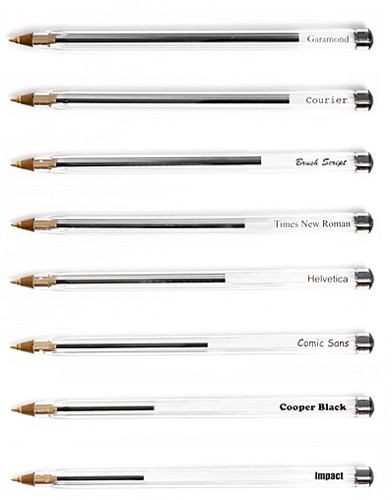 Matt Robinson and Tom Wrigglesworth took “a selection of the most commonly used typefaces (to) compare how economical they are with the amount of ink which they use at the same point size. Large scale renditions of the typefaces were drawn out with ballpoint pens, allowing the remaining ink levels to display the ink efficiency of each typeface.” See them drawing here. (Found here.)
