 While on a trip to New York City, my friend Cathy sent me this picture of quite a joyous ampersand on a storefront…
 While on a trip to New York City, my friend Cathy sent me this picture of quite a joyous ampersand on a storefront…
My friend Kate recently sent me this news
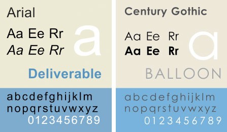
The University of Wisconsin-Green Bay is actually making headlines this week by switching the font it uses in its emails. The school says that printing out documents in Century Gothic rather than its old font, Arial, uses 30% less ink.The move is part of the school’s five-year plan to go green — and save money. Printer ink costs about $10,000 per gallon.
The article then asks “But there’s just one problem: Who prints emails from colleges?” I guess I agree, but read the entire article here.
![]() And see below to see the visual difference between the 2 fonts:
And see below to see the visual difference between the 2 fonts:
This alphabet, by Stev MacDonald is sewn by machine. First seen here, with many more pictures of his work and studio.
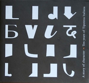 The Tipoteca Italiana is a private museum devoted to letterpress printing in Italy. To celebrate their 10th anniversary, they produced a picture book called A story of character. Ten Years of Tipoteca Italiana that is now available in English. Print has a review of the book showing lots of book spreads — with photographs of printing equipment, type, and printers — and also talks a bit about the museum. Information about obtaining a copy of the book is here.
Over on Felt and Wire, Alyson Kuhn’s post on ampersands says “what a nice device the ampersand is. An ampersand can be crisp or curvy or curly…” She includes the graphic above, with many of my favorite ampersands, as well as many more examples. She’s asking people to “send us stuff (photographed) or stories (pithy) about ampersands you have known & loved.” Check it out here.
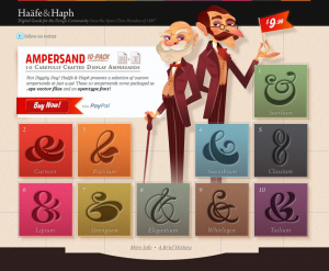 Haäfe & Haph’s selection of custom ampersands are available here.