The Ballet Font Project

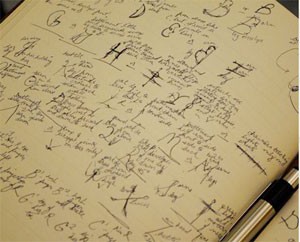
Ballet Font ProjectFirst seen on After Image: The Ballet Font Project “is a tribute to all those kids who were told to sit still and pay attention when, in fact, they just needed to move to think.” The website goes on to say:

Paula was told in first grade she had a learning disability. By sixth grade she was well below her grade’s reading level when one observant teacher recognized her poise and graceful movements. This teacher encouraged Paula to go home and create the alphabet as though she were a ballerina. Paula came back to school the next morning dancing the letters and then sequenced all 26 into a unified performance. By the end of sixth grade she was reading and writing at grade level. The following year Paula earned above-average grades.

See the font and find out more here.

Despalles éditions

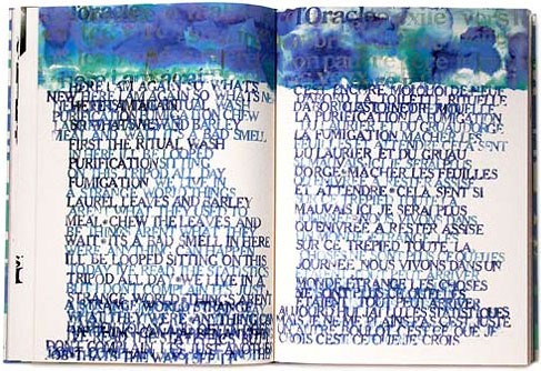
In conjunction with the CODEX book fair next February, the KALA Institute in Berkeley is offering several book arts-related workshops. I took a peek at the list, and was intrigued by one title: “When poetry meets contemporary art, or: how the text is getting a shape.” The description says it’s a lecture-workshop that will discuss, among other things, “the liberation of typography as a visual art; the variable aspects of the double-page as the basis of the book when its form is the codex” using books produced at the publisher Despalles éditions
Of course I went to their website to see what sort of books they’re making. I immediately found Cozette de Charmoy’s Oracle, below. The explanation text is in French, and unfortunately beyond the smattering I’ve retained from high school. And while Google translate is somewhat helpful, just looking at the pictures is a treat. Go here to see their work, there are several pictures for each book.

Cozette de Charmoy | Oracle

Shadow Type

This past weekend I went to the Spanish Market at the Santa Fe plaza. There were all sorts of crafts, including papercuts (called papel picado in Spanish). They are so intricate, and I thought, not for the first time, about trying one myself. I also saw a demonstration of tinwork — decorations punched into tin (see some examples here) — and I got to look at several punches.
When I got home, I found this page about papel picado that says the designs are sometimes cut the same way as tinwork: “the artisan … cuts through multiple layers of paper using a mallet to pound finely sharpened chisels of varying sizes and shapes through the paper and into the sheet of lead.” (Who knew? I assumed they used scissors or an xacto blade!)
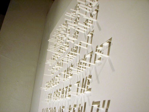
Today, courtesy of Steve Mehallo’s blog, I found a seemingly easier papercutting method — shadow typography done by Seree Kang — see below. You can see more of her work here including a variation she calls “Cube Typography.”

Seree Kang’s Shadow Typography

Type Camp

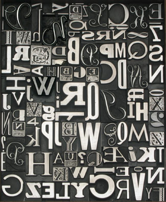
Metal Type in a Box from EbayThis message recently posted on the Book Arts Listserv piqued my interest.

Have you had enough of the computer and electronic design?
Are you ready to return to the hand crafted side of the profession?
Do you love books and want to learn more about typography and printing through book production?

Return to the handmade at Type Camp Book Arts in Buffalo, New York. Here you will discover a new sense of tangibility in this ‘unplugged’ printing workshop as you’ll get ink under your fingernails, cast your own lead type, and even use power tools to kern letters. (When we say ‘hands-on’, we mean it!)

Type Camp Book Arts Buffalo will focus on the resources of the Western New York Book Arts Center, situated in downtown Buffalo, New York, managed by P22 type foundry founder Richard Kegler. This working printing museum has hundreds of metal and woodtype fonts and flat bed and platen presses, all of which allow for total immersion into the letterpress experience.

Campers will experiment with other timeless techniques including papermaking, foil stamping, and even typecasting during this intensive hands-on week. We’ll start with a pool party and cook out at the P22 compound and then there will be field trips to type dealers, rare book collections, and as a special experience, the final day of camp will take place at the legendary Roycroft Press . We cover all of your housing, food, classes, supplies, trips, and teaching for CAN$2390

I took a look at their website and Flickr pool and discovered they had camps in India and London.

Cover Browser

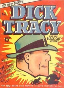
Cover from Cover BrowserOne of the best things about the web is that people share their collections. Like Cover Browser, over 455,613 covers from 2,923 different series of (mostly) comic book covers. I like that the type and colors on these covers fairly screams at you to read the books inside.

Unseen Hands

Unseen Hands: Women Printers, Binders and Book DesignersLast weekend I stumbled upon an online exhibit from Princeton University Library’s Graphic Arts Collection called Unseen Hands: Women Printers, Binders and Book Designers. The introduction to the exhibit starts

Women have been involved in printing and the making of books ever since these crafts were first developed. Even before the advent of movable type, there was a strong tradition of women producing manuscripts in western European religious houses. In the Convent of San Jacopo di Ripoli in Florence, we find the first documented evidence, in 1476, of women working as printers. Girls and women were often trained by their fathers or husbands to assist in printing businesses, and there are many instances from the fifteenth to the eighteenth centuries of women taking over and managing these enterprises upon the early demise of their male relatives.

It’s nicely arranged — you can look at the women featured by name, occupation, thumbnails of their work or on a timeline. Links lead you to a short summary of each woman’s work and more pictures.
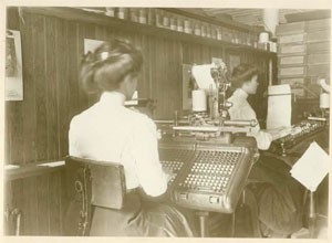
Pictured above, women setting type at a monotype machine at the Riverside Press, Cambridge, 1911 (seen here).