The Making of an “S”

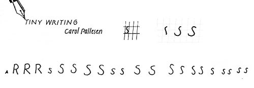
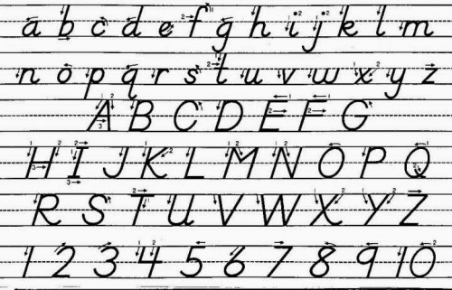
After I posted about my experiences in Carol Pallesen’s tiny writing class, Karen wrote and asked why I thought making an “S” was so hard. Simply, it’s the curves. As I’ve practiced over the last week, the letters that are hardest (aside from s) are o and e. Carol suggested we write these in 2 strokes, starting at 11 o’clock, drawing the left side of the curve, lifting the pen and drawing the right side. For someone who always starts at the top of the letter or at 1 o’clock, this has been a hard habit to break. And remembering to write the letter as 2 strokes seems to be impossible.
Below I’ve shown Carol’s lovely handwriting, followed by her ‘s’ example. Carol suggested we draw the s with 3 strokes (at the right is my attempt to show the 3 stroke progression). Below that is one of my practice lines, where I find the second stroke to be the hardest. Karen also asked about the slanted-ness of the letters. Here is a PDF of my practice paper (it has a very light grid to help me keep the lines straight and letters slanted the proper amount). I’m learning that a 5% slant is really not very much.

Tinywriting and that darn S

Looking

Secret Knowledge by David HockneyRecently I read a review of the movie “Tim’s Vermeer,” which details inventor Tim Jenison’s efforts to duplicate the painting techniques of Johannes Vermeer using optics and lenses. The review mentions David Hockney’s book Secret Knowledge which covers the same subject. Since the movie hasn’t shown up here in Santa Fe, I got Hockney’s book from the library instead.
Hockney’s premise is that European artists used lens and optical tricks to produce paintings that are almost photo-realistic, long before the invention of the camera. To investigate this idea, he covered the walls of his studio with a time line of reproductions of Old Masters and started studying them. The book takes the reader along his journey to find clues to back up his theory. The first half is primarily visual, full of good color reproductions, as he walks the reader through his observations on painting between 1400 and 1500 and how there was a giant leap toward realistic portraiture. Whether or not you believe Hockney’s thesis that it wasn’t just artistic genius but optics that helped produce the art, he makes you look at the paintings in a new way. He says at the beginning that easily attainable full color reproductions and Photoshop have made verifying his thesis possible. And that the book is the perfect medium to present his argument (rather than a video or museum exhibit or even a lecture):

You bring your own time to a book, it is not imposed, as with film or TV. With a book you can stop to think something through, or go back and look at something again if you need to.

The rest of the book is written material to back up his theory, most of it in a very hard-to-read font, which wasn’t at all pleasurable to read. But the front half is a lovely treat for the eyes!

Daylight Time

My first daffodils of 2014

While the east coast of the US has been buffeted by storm after storm this winter, here in the Southwest winter has been a non-event. We had one big snow storm at the end of November, and then nothing. January and February were dry and unseasonably warm. While my friends on the east coast can’t wait for spring to start, I’m lamenting the end of winter. There’s a magical silence on days when it snows here that is so rejuvenating, at least for me, and I only got one or two of those back in November. But today I woke to an unexpected overnight snow fall. And the snow has continued, big fat flakes falling lazily from the grey clouds, all morning. Above is a picture of a little hill in my yard where I’ve planted daffodils bulbs—and in the middle are the first shoots coming up in the snow.
Tonight we turn the clocks back for daylight savings time. Or is it daylight saving time? And should there be a hyphen (daylight-saving time)? According to dictionary.com, all three are acceptable. As is “daylight saving” without the “time”. Whichever way, I prefer light in the morning rather than the evening.

Tiny Handwriting

Nelson Handwriting

It’s fascinating how a small comment or image, barely acknowledged, can shape my ongoing projects. Last year, watching Aimee Lee weave tiny tiny baskets from paper scraps I was taken with how she collected every piece of leftover paper, no matter how small, to use in some project or other. My matchbox books are a reaction to that experience—among other reasons, they started as an attempt to use up the huge box of paper scraps I carted from California to Santa Fe.
Last fall, I saw one of Margy OBrien’s books and commented to her about her lovely calligraphy. She sent me the name of the book she’d learned from; I did nothing about it. But since then I’ve started paying attention to handwriting. And especially my own. I do the crossword puzzle in the paper every morning, I write shopping lists, over the holidays I wrote letters and cards, and every night I write a haiku. For years I’ve done the crossword puzzle with a special pen—it makes me feel more confident I think. So instead of writing my haiku with whatever came to hand, I’ve started using a particular sharpened pencil. And my notebook is the neater for it.
And later this month I’m taking a workshop called “Tiny Handwriting” taught by Carol Pallesen. Here’s the description: “Make your letters small, smaller, smallest as we work with tools conducive to tiny writing: microns, crowquills and sharper edged pens. Spend two fun-filled days learning three alphabets – Monoline Italic, Clothesline Caps and Willow by Hand – and investigating the demands that tiny writing places on these tools. The results will be used in 3 miniature book creations.”
The picture is the how letterforms are taught in the Nelson method. I remember learning my letters from a book with a page like that. It’s apparently still taught, and the handbooks are still available.

Serenity

Mid-winter is always a very quiet time for me—lots of planning for the year and slowly refilling my shelves with all the things I sold over the holidays. I think that’s why I’m drawn to images of quiet books this time of year. The one below is by Meredith Beckett (I can’t find a website for her), made as part of a book swap. I found it on this blog post. I especially like the shapes and interplay of colors as well as its simplicity.

notuboc.jpg