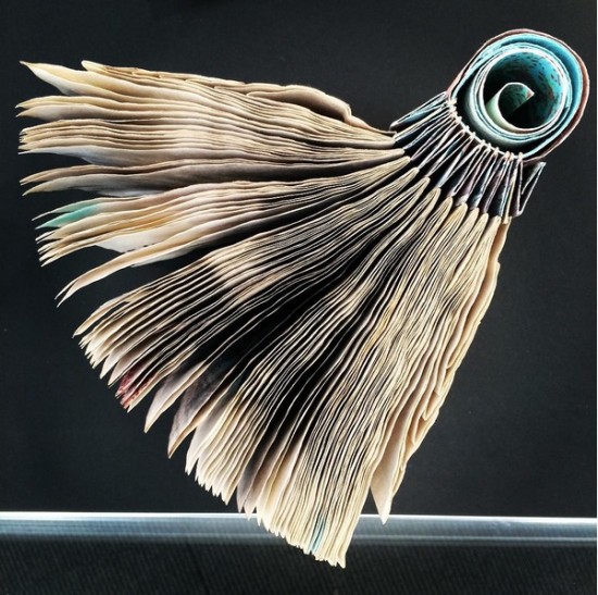
An exhibition just opened at the San Francisco Center for the Book: The World Of Hedi Kyle: Codex Curios and Bibli’Objets. They posted this really great photo of one of Hedi’s books on instagram. There’s an exhibition catalog available here.
![]()
An exhibition just opened at the San Francisco Center for the Book: The World Of Hedi Kyle: Codex Curios and Bibli’Objets. They posted this really great photo of one of Hedi’s books on instagram. There’s an exhibition catalog available here.
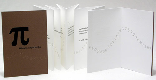
This is the first book I printed letterpress: a small artist’s book with Wislawa Szymborska‘s whimsical poem Pi. There’s a nice article from last year’s New Yorker on “Why PI Matters.” The author says: “What distinguishes pi from all other numbers is its connection to cycles. For those of us interested in the applications of mathematics to the real world, this makes pi indispensable. Whenever we think about rhythms—processes that repeat periodically, with a fixed tempo, like a pulsing heart or a planet orbiting the sun—we inevitably encounter pi….pi appears in the math that describes the gentle breathing of a baby and the circadian rhythms of sleep and wakefulness that govern our bodies…. In short, pi is woven into our descriptions of the innermost workings of the universe.”
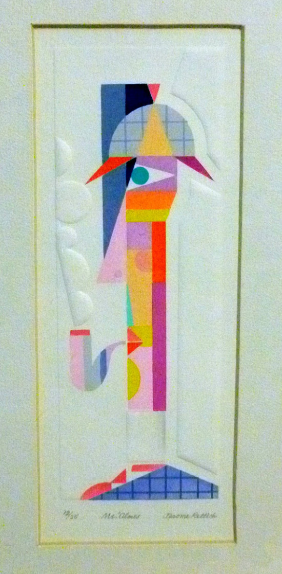
I ran across this pochoir and letterpress print by Jeome Rettich (b1915-d2006) the other day. I love the combination of color with the blind embossing. This print, and others, are being sold by Rettich’s grandson here. There’s a facebook page with more information here.
If you don’t know about the stenciling technique pochoir, I’ve written about my attempts and how to do it here and here.
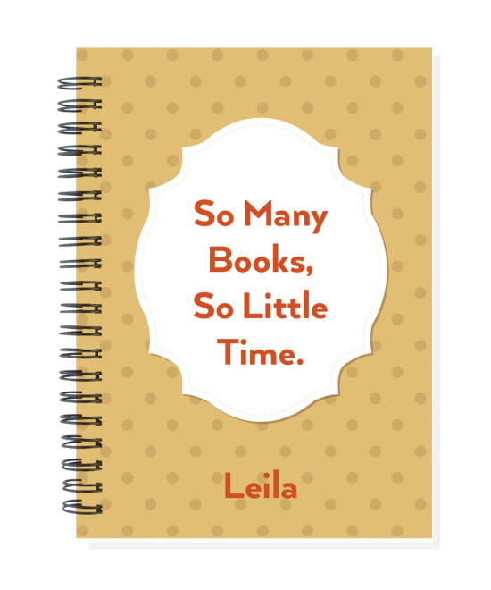
For a long time I’ve made little — 3×5 — reading diaries to track & rate the book you’ve read. I recently started making a personalized version that is the same as my notebooks — 5-1/4 x 7-1/4. Here’s the newest design. See them all here